Sold.
I'm kind of pleased with this one. I love how the Munsell complementary colors really pop, and square plates are way fun to paint, and the shadow of the fork was a bit of a challenge, but it even looks like stainless.
I've been looking at the work of Caroline Jasper. She starts with a really hot red ground, and keeps it visible in her final work (although she'll attenuate it in the background for landscapes). It gives her paintings an intensity I like. So I started with a red ground for this one. I actually found that some of my paints were too transparent, and I had to add some white to get them to cover the red enough. But I like the overall effect. No many neutrals here! That might be too hot if this was a 30"x36", but at 5x7 it works.
Here's a Caroline Jasper demo.
Sunday, December 23, 2007
Saturday, December 22, 2007
"Kapiolani Beach 1," 8x10, oil on canvas board
Sold.
I'm still thinking about this one. It doesn't speak to me, but my husband thinks I underrate myself.
I noticed something that would be a good exercise if taken further. I was looking through some painting books that I've grazed and added sticky tags to in the past. The exercise is to notice what kind of art attracts you. Mostly, for me, I find it's the bold, bright art. I guess I really like the impressionists and colorists.
But... Then I turn and do something like my fig painting from a couple of months ago. Very dark. Very sedate. But it has those greens and purples coexisting against a really rich background. Or the Study in White Fuzz I did awhile ago. But I like it for the dandelion head and the rough edges.
I guess you can like lots of stuff. But the point is to figure it out so that when you paint, you're in synch with yourself. That's when painting feels best.
Friday, December 21, 2007
"Three Stones," 6x8", oil on hangable art board
Ah, time flies like an arrow (fruit flies like a banana!). Since the last entry, my husband and I visited Honolulu (where I grew up) and he finished the Honolulu Marathon. I am in awe. We saw old friends and visited old haunts. It Was Good.
Back to painting. I started this before I the trip and finished afterwards. It was initially meant to be a lovely realistic composition in tones of grey, both warm and cool. But, somehow, I didn't feel like doing that. I felt like building color. Thank you, Hawaii, and also, thank you Caroline Jasper. She often paints on a background that's toned hot red (behold a demonstration). I like the effect and applied it here, since this was too monochromatic. After slashing the red into the background, I went over it in shades of white. I think this is much more lively. It's kind of calm yet energetic. Sort of hot zen? Hey, maybe that would be a better title.
Thursday, December 6, 2007
"Yellow Pitcher," 6x8, oil on hangable art board
This one was a challenge. It's a pitcher I got at an antique store; probably goes back to the 50s or 60s or so, and it's quite charming. I set it up in high contrast to emphasize its lines and shadow. Then I had a deuce of a time getting the ellipse of the top anywhere near right. Eventually, just for grins, I decided to turn it into a two-value painting, but get as much color into those values as I could. Not a bad exercise.
Wednesday, December 5, 2007
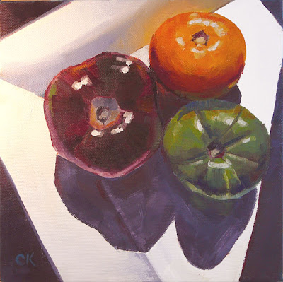
"Three Heirs," 8x8, oil on gallery-wrapped canvas
This was fun. It felt like some of the skills I've been working on finally applied themselves. Specifically, I've been trying to paint with more mixing the color on the canvas and less blending; to get that dark belt you see on spheres like tomatoes; to get reflections that looked organic; to go darker; and not to futz as much. All of these came out better than in the past. In places, it painted itself. I liked Tom Brown's comment about that: Sometimes you're just holding onto the paintbrush and it's going by itself.
I painted this from a photo I took at my father-in-law's house. These three gorgeous tomatoes were going to be part of dinner, and they contrasted beautifully with each other and with the square plate. I set them up in the afternoon sunlight, with the shadow from the curtain across the right side of the plate.
One thing new that I tried was to do the highlights in two steps. So today's lesson is this: When doing highlights, try first putting down a shape of white mixed with the surface color. Then place your purer white on top of that. It seems to make it sit on the surface better. Some people suggest that you lean the white toward the opposite temperature of the surface, but just a bit. I'd like to hear opinions on that.
Friday, November 30, 2007
"Vasquez Rocks," 6x8x3/8", oil on ready-to-hand canvas
As I understand the daily painting movement, its purpose was to keep painters practiced and loose by doing something small every day, as opposed to the ongoing work required for a larger piece. It's possible that the idea was that the painters would still compose their larger works, while the smaller ones helped them build skills and keep momentum going. Interestingly, the small paintings have taken on a life of their own, online. Well, at least with me. I love their intimacy and how they fit into a normal house. You can put them up anywhere to grace a nook or a cranny (or a crook or a nanny). They don't all have to be above the fireplace or couch.
That said, I did a 4x5" sketch during my Tom Brown workshop a couple of weeks ago, and liked my initial painting enough that I wanted to do it bigger. Funny that 6x8 is bigger, but it's twice the size of the original. We had gone to Vasquez Rocks, which is amazing, and is also where lots of movies were filmed (do a web search). It's so photogenic, and I got that thrill of playing with colors.
This was the 4x5" sketch of the rock. It's more raw, and I often like that. It's paler, too, although that might not be visible in the web photo and it might depend on your monitor, yadda yadda.
This is my photo of the rock itself (slightly different angle). It's a pretty amazing piece of geology. In this photo it looks awfully gray. I recall it being much richer, but, again, that might be the photo.
So maybe I'll do the rocks again, even bigger, on a normal canvas. Could be fun.
Wednesday, November 28, 2007
"Red on White," 6x8, oil on canvas board
This is another painting I did in the hotel during the workshop a week or two ago. It took me some effort, partly to find what to paint (see prior post) and partly to set it up just so. I admire that the teacher, Tom Brown, is able to just stop somewhere and gather his impressions of a scene on canvas, and do it quickly. I still tweak and poke. But I do rather like the stem area of the front apple. And those little white dots.
Painting quickly seems to require a couple of pretty interesting abilities: 1.) A level of skill with draftsmanship and manipulating paint, and 2.) getting out of your own way (losing the fussing). Maybe 1 leads to 2 and both lead to trust. And trust eases fear. This is one reason the small sketches are often so charming: there's no pressure to perfect or sell, so they're freer.
Saturday, November 24, 2007
"Enjoy Our Complementary Amenities," 6x8, oil on canvas board
Busy week, this. We had 24 people at the house for Thanksgiving, which affected how much painting and posting I could do.
I'm still digesting what I learned at the Tom Brown workshop and will write more on that later. But while I was at the workshop and in a painting frenzy, I did a couple of pieces at the hotel where I was staying. That was a bit of a challenge, since it's hard to find paintable things at a hotel. What, you should paint the shampoo bottle? So I used items from the snack bar.
I'm kind of pleased that the tea bag looks like a tea bag here. Of course, when you're painting from life, life keeps changing, and I believe I had to refresh the water in the tea when it got too dark.
Saturday, November 17, 2007
"Vasquez Sunset," 6x8, oil on canvas board
Today was the first day of the workshop with Tom Brown (see my links). He's a skilled teacher, and understands what newbies need to know, and I was interested in how he manipulates color. He showed how you can take a base color and modify it in different ways for different parts of the same scene (this isn't quite clear, but I'm tired). At the end of the day, we had to be out of Vasquez Rocks park at 5:00, and it was 4:00 and the deadline also meant cleaning up. I wanted to paint the view I could see, which had the wonderfully layered hills, receding through the light (I love the Chinese paintings that do that!). With limited time, I worked the palette as Tom showed us. I started with the color of the furthest-away range, then modified it for the next closest, and the next, and so on. This is what I came up with, and it was a great way to end the day.
Wednesday, November 14, 2007
"Hot Garlic," 6x8, oil on hangable canvas board
This is my second piece using M. Graham oils. They certainly do feel more lush than the water soluble oils. And the colors are a more intense; they deposit pigment anywhere a lot more easily (hands, easel). Clean-up was a lot harder. On the whole I don't know that I want to adopt them as my default paints. But I believe you can mix water-soluble oils and traditional oils to some extent. You have to be a bit careful, and you do lose the water solubility at some point. But I'll look into it. It feels like there might be some use in these for some pictures.
All that aside, I was in a WTF mood when I painted this. I'd had a tough day and I just shook it off and cut loose. And, boy, was this fun. After recent paintings of bottles, where I had to be pretty tight and careful, it was fun to just put down whatever color and shape I felt like. No, the draughtsmanship wasn't that good (which made this a lot easier), but hey, it's garlic. And the colors are pretty impressionistic. But it has a looseness I like, probably because the background isn't filled in.
So this Friday I'm driving to LA for another painting workshop, this time with Tom Brown. His workshop is for plein air painters of all levels. I'm a rank amateur. But I live on the edge of several open space preserves in the Santa Cruz mountains. I can have a view of the San Francisco Bay on one side and the Pacific Ocean on the other, and it's stunning. I hike daily for my happiness and sanity, and I want to spend time out painting it. The dog would like that, but he's a ten-month-old Jack Russell Terrorist and would probably be a pain. Maybe when he's older.
Tuesday, November 13, 2007
"Four Tomatoes," 7x7, oil on gallery wrapped canvas
NFS. I've been painting with water-soluble oils (or "miscible"). I've pretty much found them to be easy to use. I tried three brands, and here's my assessment (today's lesson: comparing water-soluble oils):
So I decided to try more traditional oils. Preferring to avoid the whole issue of toxic junk, I ran across M. Graham oils. They're diluted using walnut oil, which is safe. They're also compounded out of very intense pigments.
So, what happened? Well, I wasn't used to having a layer of paint, then gently layering a thinner layer over it. It's like painting with whipped cream or something. It's kind of alien, especially to someone who recently took a Carol Marine workshop: My gosh, she lays down the color in strokes that are confident of themselves. And I can't do that with the M. Grahams.
Then again, I seem to be looser, and the colors stay open longer (i.e., moist, so you can move them around). Now, in order to paint the tomato stems, I had to go in with my little wipe-out tool and clear the strips where I wanted the stems to go.
Also, clean-up was a pain. Tomorrow's painting was done with the same paint and the same brushes, and was also looser and loads of fun, but, boy, getting the paint out of the brushes was difficult compared with water solubles.
Conclusions? Beats me. The pigments in these seem to be stronger, but I don't know that that's because they're oil soluble; maybe they're just made that wayl. But, OK, maybe with softer paint I let myself relax a bit? Not sure.
I'll keep playing and posting. This art crap is really subtle, isn't it?
- Winsor & Newton: I use these and like them, but they're kind of stiff out of the tube.
- Holbein Duo: Nice and buttery, but don't mix well with water. Sort of like mixing water with butter. Would probably be good for palette knife work, which I should try one of these days.
- Grumbacher Max: Dry too fast. Like, you can't work them the next day.
So I decided to try more traditional oils. Preferring to avoid the whole issue of toxic junk, I ran across M. Graham oils. They're diluted using walnut oil, which is safe. They're also compounded out of very intense pigments.
So, what happened? Well, I wasn't used to having a layer of paint, then gently layering a thinner layer over it. It's like painting with whipped cream or something. It's kind of alien, especially to someone who recently took a Carol Marine workshop: My gosh, she lays down the color in strokes that are confident of themselves. And I can't do that with the M. Grahams.
Then again, I seem to be looser, and the colors stay open longer (i.e., moist, so you can move them around). Now, in order to paint the tomato stems, I had to go in with my little wipe-out tool and clear the strips where I wanted the stems to go.
Also, clean-up was a pain. Tomorrow's painting was done with the same paint and the same brushes, and was also looser and loads of fun, but, boy, getting the paint out of the brushes was difficult compared with water solubles.
Conclusions? Beats me. The pigments in these seem to be stronger, but I don't know that that's because they're oil soluble; maybe they're just made that wayl. But, OK, maybe with softer paint I let myself relax a bit? Not sure.
I'll keep playing and posting. This art crap is really subtle, isn't it?
Sunday, November 11, 2007
"Two Bottles," 6x8, oil on canvas board
SOLD. I think this is the final showing for the little brown bottle, at least for the moment. Actually, it was the big green bottle that put up a fight. No, it was the shadow of the big green bottle.
There's a theory out there that if you see it, you can paint it; just paint the shapes you see. What I found with this is that I did a better job on it if I understood the shapes. In other words, the light colored floor reflected in the green bottle, and you could see that through the brown bottle. Once I started tracing that this light streak was connected to that one--even though it went through the brown shape--I was able to show it more accurately.
I should have a sketchbook and carry it around and draw random things in it. Yeah... And then there's the theory that you should have an odd number of items in your picture. Hmm... Maybe that applies to larger-format artwork.
Thursday, November 8, 2007
"Brown Bottle, White Mug," 6x8, oil on canvas board
I'm really enjoying this little brown bottle. It's maybe 5 inches high, and I got it at an antique store. I figure it's an old medicine bottle of some kind. Don't know. But it does interesting things with the image behind it and you have to really pay attention to colors and shapes. You learn that way.
And, of course, the idea is to learn. You probably don't always know what you learn, but if you can figure it out it's not a bad thing. What did I learn here?
- If your canvas leaps off your easel and takes a face plant on the carpet, you're liable to spend some time pulling fuzz off. Tweezers are good. I actually pushed the brush backwards through the fuzz to pick it up, then used the tweezers to pull it off the brush. And FWIW, the carpet is a cheap thing for cushioning my feet, so the paint stains don't matter.
- If you're going to paint something behind something else, and it sticks out on both sides, draw it without the front thing. I got to a late point in this piece and the mug handle kept looking wrong. I finally removed the bottle, triangulated the handle (you know what I mean) then put the bottle back.
- Painting white crockery is still hard (I did a couple of pieces with white crockery earlier this year). But it's fun to blend other colors into it.
Wednesday, November 7, 2007
"Coy Garlic," 6x8, oil on canvas board
UPDATE (from what follows this image): Well, this is the new and improved garlic.
Check it out vs. the image that follows. I swear, it's not quite as true to what was there, but I do think it's less confusing. The composition and overall feel of the piece aren't affected, so all is well.
(Original post.) I like how this came out, but this is not the final version of this painting! See the dark line around the garlic behind the bottle? I showed this to my husband and he said it looked like there was a hole in the garlic, so I lightened it. I keep hearing (or reading) that you should stick with what life shows you, but, boy, in this case it didn't work. Maybe it means I set it up wrong. Either way, I'll post the update tomorrow, after I get a good shot of it using sunlight.
I think this bottle has a lot to teach me about really seeing. Glass that's both contorted and tinted makes colors and shapes tough to figure out. Compositionally it's the classic setup where there's a tiny object off to one side that provides balance. I placed the bit of garlic skin so it sat in the line created by the top of the garlic and the top of the shadow of the garlic. Triangular composition, FWIW.
Looking at it now, the garlic looks kind of coy, or like it's hiding behind the bottle. I wanted to name it something like, "Hey, Get Back Here!" or "Coy Garlic." But that would be silly, wouldn't it?
Tuesday, November 6, 2007
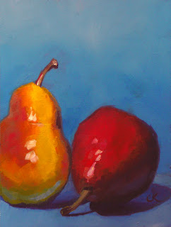
"Cousins," 6x8, oil on canvas board
This is another hot one. The colors, I mean. A few recent things have had those vibrating colors. I read somewhere recently that children like bright colors, and as you mature you come to appreciate the quieter colors. Maybe visually I'm still a kid. Hey, Justin Clayton also just did a painting of two pears, one standing; one lying down. Quite a difference.
I don't know. I'm going to go paint.
Monday, November 5, 2007
"Two Tiny Persimmons," 5x5, oil on gessoed board
OK, this is the last thing I did in last month's workshop. It's little, and I did it one afternoon after class ended. But I do love persimmons; they're photogenic. I find it interesting to note, though, that a few months ago I did some 4x4 paintings, and the size was fine. But now this 5x5 feels cramped to me. I've been trying to paint with bigger brushes, so maybe that's why. They say you should paint with the biggest brush you can stand to keep from futzing.
Friday, November 2, 2007
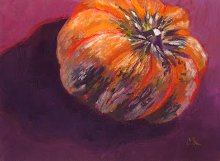
"Neon Gourd," 6x8, oil on canvas board
After yesterday's dark picture of three figs, this one seemed almost neon bright. Now, I've been noticing that a 6x8 painting of one item gets finished faster than an 8x10 that's more complicated (duh). This one, though, while only one item, was a pretty complex one: all those lobes, and the green and white streaks. It was pretty hard to draw. Also, while I decided to put the focal point in the upper right quadrant, I didn't want the gourd facing in. Having it face out seemed different and more interesting. And I still put the shadow behind it. Now, this gourd has a pointy bottom, so it kind of sat askew. All of that contributes to a sense that it's floating, or even flying. I almost named this Flying Gourd.
Thursday, November 1, 2007
"Fig 3," 6x8, oil on canvas board
NFS. I felt like painting figs. I now love painting figs! You have to mix a kind of greenish purple (or purplish green), which shouldn't be possible since they should make brown. Maybe they're next to each other on the canvas, so they're not mixing. I don't know, but it works. I also got the frost edge that you see on fruit like this. It's a matter of not letting your brain fool your eye: Just look at the color; it really is just purple with some white mixed in.
This is a departure for me, at least for recent stuff. I've been doing bird's eye compositions with primary colors that look hot near each other. This is darker, more like the chiaroscuro paintings. Sort of. And it's at eye level. I must buy more figs to paint while they're in season. These got eaten pretty quick.
Tomorrow's painting will be a pretty big contrast.
Wednesday, October 31, 2007
"Look Away," 9x12, oil on gessoed board
SOLD. This was the last thing I did before going to the workshop last weekend. I think I spent a week on it, partly because I was going for a specific effect. I didn't get that effect, but I'm not displeased with it. It still has a kind of glowing effect. Maybe it's the halo around the flower (another concept from Oil Painting Secrets from a Master and David Leffel). 'Nuff said tonight. There's a gourd posing for me that wants attention.
Tuesday, October 30, 2007
"Two Radishes," 6x8, oil on canvas board
All art lies. That's a much too dramatic statement to make when I'm posting radishes, but there's a reason. These are not radishes; this is just a picture of them. Also, the bowl did not have reflections, nor was it darker on the left than the right But without those effects, the bowl just looked flat. So the painting lies.
Looking at this and recent paintings, it seem to me that I've had a theme. In Oil Painting Secrets from a Master, David Leffel is quoted as saying "You must have a concept before you work out a composition for your paintings..." His concepts are things like how light moves across his still life set up (not stuff like the futility of blah blah in modern whatever). I think my recent concept has been "Look at those cool shadows!" Also, "I want to paint complements I've never painted before."
Gosh this is fun.
Sunday, October 28, 2007
"Two Persimmons," 8x10, oil on ready to hang board
I call this a qualified success. Now, I'm actually rather pleased with how it looks. The persimmon on the right changes color smoothly. You can almost feel it. The "qualified" part of the success is that I'd wanted it to be more painterly. I wanted to lay down visible brush strokes that assembled themselves into a 3-D picture (if you see what I mean). I think the issue here is that I was using painting medium. I use water-soluble oils, and I use water to help me paint. Medium seems to make the surface and the paint really slippery. I couldn't get it to behave, and it took a lot of time to finish. So I either need to experiment with media more, or give up altogether. Hmm.
Saturday, October 27, 2007
"Tiny Tomatoes," 6x6, oil on ready-to-hang board
This one might be a keeper. These tomatoes also traveled to my workshop and back (see prior post), and they didn't have much more time left, so here they are. I love the green against the reddish-purple. Now, one of my goals is to be more of a bold painter. What that seems to require is a keen eye for seeing what's there, then the ability to put down the right stroke in the right color and let it be. These tomatoes, with their stripes that look like watermelon, were conducive to fussing. So, while I fussed more than I wanted, they're still wonderful little tomatoes. Can tomatoes be cute?
Friday, October 26, 2007
"White on Blue," 5x5, oil on board
This was another picture from the workshop. After the second day, I felt like painting some more, so the manager loaned me the key and I went back after dinner. I painted all by myself, and this, as they say, almost painted itself. I did it in about 40 minutes or so. It's possible that I was able to paint fast because the bathroom was locked and, ahem, I had to (paint fast). I have not tested this theory since then.
The next day we did an interesting exercise in which Carol challenged us to do a painting with the least number of strokes possible. I decided to consider the blue picture a study, and use the same onion. I did this in something like 196 strokes, and I love the painterliness of it. Below is the only picture I took of my painting table at the workshop. It's the setup for the prior picture.
There seems to be something about onions that suits my painting style.
Thursday, October 25, 2007
"Dipping One Toe," 8x10, oil on board
This is my first solo painting after Carol Marine's workshop. The colors are brighter, which is fun. Carol recommends the Munsell color scheme because the complements seem to her to be more true. I'd looked it over, but had never compared the complements to those in the RGB wheel, and I believe she's right. The complements are hotter. I gather that Munsell chose the colors based on research with eyesight afterimage, so maybe that's why.
I chose to do it because one of the workshop paintings was this:
(Same onion, which is funny. It traveled from Silicon Valley to Sacramento and back.) I liked the composition and the shadow. But I do like the newer one better. Granted I worked on it longer, but it's more oniony; you can see the papery outer layer. The composition is better, too. And it's braver. Remember that word from the prior post: Courage!
Wednesday, October 24, 2007
"Fuyu Persimmon," 6x8, oil on canvas board
I'm not sure I can sell this; at least, not yet. This last weekend I took a wonderful workshop from Carol Marine. I loved it. It was my first painting workshop ever, and I reveled. I had stumbled on Carol's work early, and admired her sure hand, but it's one thing to admire someone's work, and another to watch them paint something and see how they manipulate the colors and brush, and how they build the piece. (It was also good to see that even the teacher sometimes struggles. As she Carol, "Every painting is like a chess game. You don't know how it's going to come out.")
So I feel like it tightened up my approach. I've been thrashing recently about what I want to paint, and in what style, and had fallen into the futzing school of paint: If I poke at it long enough, it will come out OK. Carol emphasized looking at your setup carefully, blending the right colors, and putting down sure strokes that move the composition forward. (Well, she covered a few other things, too.)
This piece was the last one I did on the final day of the workshop. Most of the people were packing up to go home, and I worked while clean-up swirled around me. Carol would come over, say something kind, then tell me to darken it. She had to do that about three times. So I finally went boldly dark, and it popped. There's a lesson there. Courage.
I'll be posting more pictures in the next few days.
Saturday, September 29, 2007
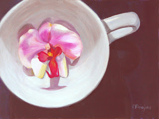
"Orchid in a Cup," 9x12, oil on gesso board
I admire the exquisite work of painters such as M Collier and Jelaine Faunce (see my links). This was an attempt at something like that, although I'm not as good as they are. Maybe some day. I actually finished this some weeks ago, but couldn't get a good picture of it, then we went to Ashland, OR, to watch Shakespeare (which you should do, too). But this morning the windows in the living room were misted up and I got the kind of diffused light I wanted. I should build a light box.
Anyway, this one took me about a week to do (hey, I did do some daily painting; just not a daily painting). There was an interesting point where I used Photoshop to resolve an issue, to wit: In the setup, the orchid reflected pink into the cup. It was quite beautiful, and I tried to capture it. Here's how it looked:
But it wasn't working for me, for various reasons. So I took a picture and opened it in Photoshop. I selected (or outlined?) the pink and poured in the off-white of the cup. Here's what it looked like. You can click the picture if you want to see it bigger. It's rough, but it was a test.
I liked it, so I removed the pink reflections from the actual painting. Later I also punched up the shadows in the upper half of the cup. Doing those two things made it so much simpler, and didn't distract you from the orchid. Painting is partly about seeing clearly and painting that (which is hard enough), but it's also about choosing what you want to see.
PS: The other thing to notice is the creepy eye shape just below the handle. Absolutely not on purpose. It's just the way the light hit the brush strokes. Kind of cool, though. I think...
Saturday, September 15, 2007
"Pear, Solo," 8x10, oil on gesso board
I love the work of Carol Marine. She has the ability to paint much more loosely than I do, and yet to put the right color in the right place so that what she paints always looks right. I was going to try to make this painting much looser and a bit impressionistic, but it had a mind of its own. To get a texture that fit in, I patted the body of the pear with the side of the brush.
Summer is great for the daily painters: All the fresh produce is downright inspiring.
Sunday, September 9, 2007
"Polished Stones," 8x10, gesso board
Friday, August 31, 2007
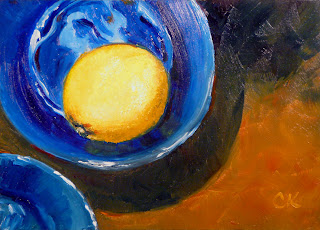
"Lemon in a Blue Bowl," 5x7, gesso board
Thursday, August 30, 2007
"Apple," 9x12, oil on gallery-wrapped canvas
This is one of those pieces that paints itself. Seriously. I did a smaller version, liked it, and decided that was a study. (What the hey.) So I did this one on stretched canvas. It's almost a graphic more than a painting, but I am especially fond of the little spots on the skin. Anyway, it's the end of the month, and I have a couple of pieces that I haven't posted. In two case I didn't like them, although I've fixed one.
Wednesday, August 29, 2007
"Glowing Hillside II," 9x12, oil on gesso board
In June I did a a 5x7 version of this picture. For some reason, that image cried out to be bigger (not that you can tell on a monitor). It also seemed like a great time to play with painting knives, which I used for the middle and far ground of this painting. For the foreground I used brushes to get that velvety look
Thursday, August 23, 2007
"Blue and Green," 6x6, oil on gesso board
I did this last night, and my critical eye was in high gear (do eyes have gears?) and I saw all kind of problems. This morning I was fresher. It looks better. Glass is deucedly difficult--and a lot of fun--to paint. It has reflections and transparencies that require you to really look at the shapes and colors. The cool part is that, since you know it's difficult and kind of abstract, that almost makes it easier: you turn off your literal brain. By contrast, the apple should have been easy, but I kept seeing reflections in it that shouldn't have been there, but were.
UPDATE: I darkened the background. The composition needed the kick.
Tuesday, August 7, 2007
"Abalone," 6x6, oil on gesso board
I got this one done a couple of days ago, but now I'm off on a trip. It's a family wedding and reunion, so no saying if I'll get any painting done, although it's to a beautiful part of the country, so I might try a landscape. Meanwhile, this one was extra fun for all the iridescence. If you want to test your ability to see wonky shapes and colors, try something like this.
Sunday, August 5, 2007
Life excitement and painting
It's been a busy time in my world, recently: We got a puppy (about 6 months old, and very energetic!); I was in a show (I also do theater); and there's a family wedding coming up (including a week of family reunion). So I'm still painting, but it's a little slower. But, hey, things should settle down in mid-August (famous last words).
Monday, July 23, 2007
"Stripes and Solids," 5x7, oil on gesso board
"Daddy's Hands," 5x7, oil on gesso board
NFS.
This is an old manual screwdriver/drill used by someone born about 100 years ago. He's been gone just a few years -- he lived to be 95 -- but he taught his kids and grandkids to be pretty handy. This tool shows wear, and I love that. The painting is a gift for one of his kids. Tricky composition, albeit interesting. The ellipse created by the swivel (?) was tough, and so were the shadows. And the woodgrain. But if you can see a shape and paint it on your surface, the painting grows. The trick is allowing yourself to see past your assumptions.
"Salt Shaker," 5x7, oil on gesso board
"Leaf," 8x10, oil on gesso board
Sold. I live where I get to hike pretty much every day. I love this. The dog loves this. I often see leaves that seem to contain colors that don't appear in nature, which is silly, of course. Leaves are interesting to paint. If you really, really try to do all the detail, then you have to paint the whole skeletal structure, which is a mind-boggling concept. Instead, they make wonderful inspiration for impressionistic pieces.
Saturday, July 7, 2007
"Green Moth on White Tile," 5x7, oil on gesso board
Sunday, July 1, 2007
"Leggy Radishes," 6x6, oil on gesso board
"Half a Tomato," 4x4 oil on gesso board
I noticed that I was over tweaking my paintings, so I decided to make something small and quick and did this one. I succeeded, then followed it up with tweaking. Interestingly, sometimes you have to modify reality; the dark streak that runs down the middle of the tomato really is there and, in fact, is darker, but I had to lighten it up because it looked strange.
Sunday, June 24, 2007
"Post Apocalyptic Radish," 5x7, oil on gesso board
This is a watermelon daikon. We get organic produce, and sometimes I get something just because it might be interesting to paint. The colors in the daikon led me to the funny brown-grey-yellow palette. It didn't look post-apocalyptic until I saw it with fresh eyes the next day. I guess it's that yellow sky.
"Orange and Apothecary Bowl" (update), 6x8, oil on canvas board
The background in the original still didn't feel right. Back to a rich, neutral brown with related colors emerging.
Subscribe to:
Posts (Atom)