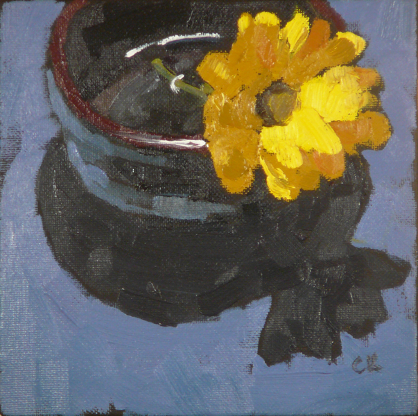
6x6", oil on canvas board
I sometimes wonder how daily painters come up with something to paint, day after day. Me, I anguish over my setups for
ages. But, of course, the solution is to use some of the same elements over again. This one uses the same elements as the prior painting but with one flower instead of three, and with the addition of the striped cloth.
And that time and effort can be important: I had decided to do three paintings this day, and if I spent
ages setting each one up, it would hamper my ability to do them all. So, this is the first. I did it in the morning. Then I did the second one in the afternoon, and the third in the evening. Of course, I had optimistically thought I could do all three by mid-afternoon, but no. Life happens, or my focus comes and goes. I actually ponder why painting is easy some days and hard other days, and there seem to be a number of factors: excitement about the work; energy level, like how much sleep you got, and if your schedule is full; mood, which is related to energy level; when your productive times are; if you have everything set out and ready (today I spent time washing brushes); and probably some other stuff. About the productive times, I've found that mine are around 7 am, 4 pm, and midnight. These are roughly eight hours apart. I can't paint during all of them, since I wouldn't get enough sleep, but it's useful to know. "I should be painting! Augghh! Oh, it's 1 o'clock. Things will pick up in a few hours."
As for this painting, it was fun figuring out how to run the stripes through the water. And I enjoyed creating the colors for the shadows. But things might be looking a bit cartoonish, I see some perspective issues, and I wish the bottle looked crisper. Still, the paintings are getting better. Must keep my eyes on the prize.