
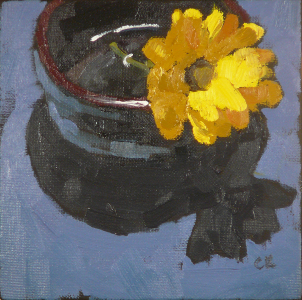
6x6", oil on canvas board
This felt like a step back after the last one. Hmm. What can I learn? Perhaps the white flowers give me problems? Maybe that I'm being too detailed in the petals? Hmm.


The next question is what exactly am I doing wrong? For the answer to that, the process of elimination must continue. I already know that there are only TWO possible errors in working from life. (Remember that.) To put it neatly, they are:
1. Painting something that is not there in a subject.
2. Not painting something essential that is there.
I also know that those two errors can only occur within one or more of the four visible elements: Color, Values, Drawing, or Edges (or some combination of those).
AND NOWHERE ELSE.


