Sunday, November 21, 2010

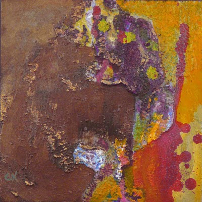
"No Latitude" (25 of 25)

 8x8", acrylic and mixed media on board

This is the final small painting I did for the show a few months ago. Now, I've continued painting, so I'll be posting more in the next weeks. 

Now, I seem to alternate between big textured abstracts and small still lifes. I don't know why. I just know that to do this authentically, I need to pursue it from my gut, and my gut says I want to do those kinds of work. 

On the abstracts front, I've been taking a class, and it's become the highlight of my week. The teacher, Stella Zhang, is immensely skilled and supportive. She also introduced me to using pigments. It's also interesting to hear her talk about pushing past her current status to the next level. So, for instance, I find I still want to do work on canvases, although I might add found things. But she pushes into three dimensions and installations.

On the still life front, I took a workshop taught by Michael Linstrom, who paints interpretively. When I do still lifes, I tend to paint tightly, and I find I don't just want a good product from my efforts, I want a good experience. Tight doesn't feel good. Loose and interpretive does. Michael takes the view that the painting does not need to accurately reflect the world, and he paints loosely to get there. There's a nice intro here. I'll be taking another workshop next month.

So, more to come.

Wednesday, November 17, 2010

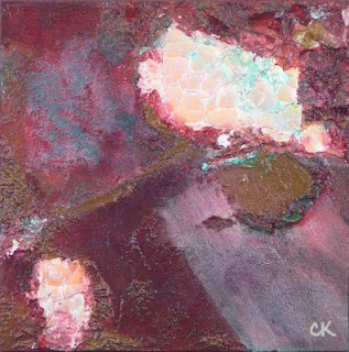
"Convects" (24 of 25)

8x8", acrylic and mixed media on board

Almost through posting these. Then I'm going to have to take pictures of and post the things I've been working on since then. In some cases, I've been redoing some of these.

However, strangely, at the moment I'm back to doing the small still lifes. Why? Well, I took a workshop where I got a hint about how to paint loosely and I want to try that more. Either that or I have a short attention spa.... Squirrel!

Sunday, November 14, 2010

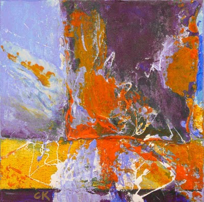
"Tirade" (23 of 25)

8x8", acrylic and mixed media on board

As explained earlier, I did twenty-five of these for the show. A few sold! But there are some that have gone back under the brush! As it were. I don't necessarily use a brush. I'll be posting those in due course.

Monday, November 8, 2010

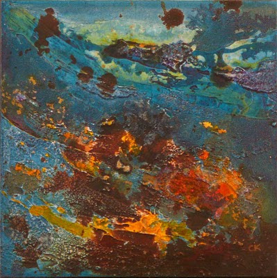
"Slash" (22 of 25)

8x8", acrylic and mixed media on board

Amazing to think that two months (and change) have flown by since I posted). But I've found that there's a pacing in these things. I started out all gung ho, but ended up giving short shrift to the other parts of my life. So I burnt out on the kind of art I was doing, since I was forcing myself. Then I played with styles, then Life Happened. And a couple of months go by.

However, I've started taking classes and a workshop or two, and I'll be posting things that come out of that. I have to say that my abstract class is the high point of my week. Even though I have to lug a box of supplies and some large canvases around, I still get excited about what I'm seeing and learning. I'll start posting things from those endeavors. Meanwhile, astonishingly, I still have a few more of my 20/20 abstracts to post.

Tuesday, August 24, 2010

"Nalu" (21 of 25)

8x8", acrylic and mixed media on board

This one felt tropical and beachy and watery and sandy, and kind of reminded me of Hawaii, where I grew up. The word "Nalu" means "wave" in Hawaiian, so it seems appropriate.

Monday, August 23, 2010

"Dual Reality" (20 of 25)

8x8", acrylic and mixed media on board

OK, it was awhile ago, but I think this one appealed to me because it's a combination of colors I don't use all that often: browns and greens together. Red I do use. :)

Saturday, August 14, 2010

"Bunting" (19 of 25)

8x8", acrylic and mixed media on board

Side view. Can you see how thick it is?

This one started with a concept, sort of like the one two days ago. Both used  that Plaster of Paris gauze before the texture medium went on. Still not sure...

Friday, August 13, 2010

"Trax" (17 of 25)


8x8", acrylic and mixed media on board

It's interesting to case back and remember what was going on when I painted this. I know that doing the twenty-five paintings for the show took a lot of time and effort. And that sometimes I just needed to come up with a title that seemed apropos. For this one, it was the grid pattern that looked like tire tracks that gave it the title.

Monday, August 9, 2010

"The Scroll" (18 of 25)

8x8", acrylic and mixed media on board

Angled view

I can't believe it's been almost three months since I posted. It's the standard excuses: Life happened. It's good stuff: some contract work, traveling, a bit of  house remodeling. But it's time to come back.

I went into this piece with an idea in mind. The outcome is kind of different from the ones where I just go into reactive mode and see what happens. And, of course, months later, I see it as almost figurative. This is one of the fun things that happens with abstract art: People want to see recognizable things in it, so their eyes find them. In this case, I see someone standing under a tree, and I can see his shadow.

Friday, May 14, 2010

"Dragon Skin"


12x36x1.5, mixed media and acrylic on gallery-wrapped canvas

The title for this piece came from Guy Magallanes, an extraordinary watercolorist I have the privilege to know. When I showed it to him, he looked at the texture and the iridescence and said it looked like dragon skin. That was a few days ago, but the description stuck with me, so I thought I'd use it.

Tuesday, May 4, 2010

"Trickle" (16 of 25)

8x8", acrylic and mixed media on board

(#16 of 25 for the 20/20 show) For this one, I was wondering what would happen if I tilted the board after starting two pools of paint. It's actually a bit dangerous, since it has the potential of looking lame. But I liked it. This also has an unusual (to me) (currently) purple and brown palette.

Monday, May 3, 2010

"No, Sir!" (15 of 25)

Connie Kleinjans fine art, No Sir, 8x8, mixed media on board

8x8", acrylic and mixed media on board

(#15 of 25 for the 20/20 show) This was more yellow and brown than most of my paintings are. I tend toward the cool colors. It might be unfortunate that I do that, since they say that people like warm color better. The title just had to do with the defiant feeling in the work. I think I also liked the way that a drip running upwards just feels out of whack. I've seen it in other paintings and it's a bit disorienting. That's why I like it.

Friday, April 30, 2010

"Succulent" (14 of 25)

Connie Kleinjans fine art, Succulent, 8x8, mixed media on board

8x8", acrylic and mixed media on board

(#14 of 25 for the 20/20 show) The name for this one came out of the colors, which are primarily a really rich burgundy and green. The diagonal patch in the lower right corner is fabric; specifically part of a T-shirt. And there are the eggshells. I made very sure they were firmly planted in patching material, so they're on there pretty tight. This might be the most media I've ever combined in one painting.

Monday, April 26, 2010

"The Great Wave" (13 of 25)

Connie Kleinjans fine art, The Great Wave, 8x8, mixed media on board

8x8", acrylic and mixed media on board

(#13 of 25 for the 20/20 show) For the paintings I did in this series, I put down the texture material and then added color. I'm doing experiments now where I add color to the texture material and apply it, then go in and paint some more. It's a little more organic, actually.

For this one, the curling shape demanded a bright focal point. That curling shape just needed to embrace something.

Sunday, April 25, 2010

"Toward the Light" (12 of 25)

Connie Kleinjans fine art, Toward the Light, 8x8, mixed media on board
8x8", acrylic and mixed media on board

(#12 of 25 for the 20/20 show) So the interesting thing about this one is that it has brown eggshells in it. (For some reason, I love brown eggs.) Anyway, I'd washed some shells and had them sitting in a bowl, for months I think, and decided I'd try using them. Also, I like the patterns made by eggshells when you flatten them. So I placed these in the texture material and pushed down on them with a small board (OK, a 4x4" piece of gessoed masonite), and got a cool pattern.

For what it's worth, I think most art manufacturers put anti-mold, and possibly anti-bacterial, ingredients in their products. Why else wouldn't they go bad sooner?

Wednesday, April 21, 2010

"Wrench"

Connie Kleinjans fine art, Wrench, 18x24,oil on canvas

18x25x0.75", oil on canvas

I think I've started a new series. I blame the book Expressive Drawing, by Steven Aimone. At his workshops, he has an exercise where the students alternate between these activities:
  • Automatic drawing: With large pieces of paper stuck to a wall, the students take a drawing tool like charcoal, conte crayon, or brushes, and they do automatic drawing. It looks a lot like scribbling in the samples in the book.
  • Painting over: At some point, Aimone calls out "Obliterate!" or "Veil!" The students stand back and take a look at their painting, then take a brush and white paint and start going over parts of it, leaving what they find intriguing or satisfying.
Repeat. As Aimone says, "...keep this processing of things going until nothing else occurs to you to do—or until you really love what you see."

I decided to do this in oil paint. I got out a canvas and my oil sticks, set up some brushes and paint thinner and color shapers. And I started scribbling. I went on pure impulse for color, scribble patterns, pace, and all that. When I felt like it, I switched to the paint and thinner. I went back and forth arbitrarily and capriciously until it felt done. Until I had no more to say. Behold the outcome.

So, what did I learn?
  • It's fun and really instinctive. Felt right.
  • And yet, you do end up following guidelines for composition: focal point, contrast, color identity (more on color identity below).
  • Oil sticks can make cool marks. Scribbly, like crayons.
  • So can color shapers. I need to get the narrow one.
And I like this painting. Mind you, I don't think it's "pretty." But there's something organic and energetic about it. Authentic. Loose.

I've been doing more paintings in this format, with mixed results. There was one where I tried to be impressionistic, tried to convey the feeling of a sunset. But it looks too contrived. I keep trying to go into a painting with an intent to convey something, and it doesn't seem to work. There's some sort of connection I'm looking to find, and can't seem to make it work. Maybe I should just surrender to the process.

Anyway, I'll be posting more of these.

OK. So, earlier I mentioned "color identity." It's that theory in art where a piece needs to tell you what it is. In regards to color, it means you need to identify a dominant color. If you don't establish one, people will find the painting lacking, and might be confused. And not in an interesting way.

And my thanks to Rebecca Crowell for things I learned in her workshop last year. Certainly I had never used color shapers and oil crayons before, but I also found myself making marks in other ways that we used in the workshop.

Monday, April 12, 2010

"Input Circuit" (11 of 25)

 Connie Kleinjans fine art, Input Circuit, 8x8, acrylic and mixed media on board
 8x8", acrylic and mixed media on board

This one has been reworked. See this page.

(#11 of 25 for the 20/20 show) I like the palette on this one.This is not a combination of colors I normally use. And I'm working on using more neutrals, so the brown was out of my normal patter. This is also quite gestural. I put down the texture material in big strokes (well, for an 8x8 painting) and then followed what it did.

I've been playing with oil sticks recently. (Yep, I'm back to oils.) It's fun. It's another way to get an interesting texture, since they leave a scribbly mark, sort of like crayons. I also just ordered some open acrylics, so we'll see where that goes. So much stuff to play with!

Saturday, April 10, 2010

"Mother Lode" (10 of 25)


8x8", acrylic and mixed media on board
 
(#10 of 25 for the 20/20 show) The show opened this last Wednesday, April 7, and runs until May 29. And a kind person stopped by the show, bought a piece, looked me up and left a comment. People can be so cool. Thanks!

So, back to this painting. I think it was the first one where I really layed on the texture material heavily, especially in the lower right quadrant. Here, let me show you from an angle:

Connie Kleinjans fine art, Mother Lode, 8x8 acrylic and mixed media on board


Does that help? You can see how thick the board is, and get a feel for the chunkiness of the gold.

I was able to do this because these are board rather than canvas. I'd mostly been painting on canvases, and they flex, which means the material could crack and fall off (I have not yet had this happen). But this is 3/8" composite, so it will support thicker material. In fact, since then I've been playing with the notion of adding found objects to the paintings. I love found art. We'll see.

Wednesday, April 7, 2010

"Eyewitness" (9 of 25)

8x8", acrylic and mixed media on board
(#9 of 25 for the 20/20 show) So, the white stuff is Liquitex string gel. I certainly don't have the hang of it. In fact, I didn't like the way it went down, so I mushed it around. I kind of liked the organic quality of the mush, so I left it. Isn't it funny, how I like organic art, and manipulate things until they look organic? I wrestle with this.

And the show opened today. Woohoo! I am in a quandary about seeing the show. It's 2 1/2 or 3 hours away, and I've driven there twice and will have to go a third time to pick up unsold paintings after the show ends. I'd like to see the show live, but, man, that's a lot of effort!

Tuesday, April 6, 2010

"Seek the Depths" (8 of 25)

Connie Kleinjans, Seek the Depths, 8x8 mixed media on board

8x8", acrylic and mixed media on board

(#8 of 25 for the 20/20 show) Oops. Sorry. I was renaming things, and this one got out without any commentary from me. And we know how important that is!

This one reminds me of Edmund Dulac's illustration for The Little Mermaid. You can see it on this page, on the right, if you scroll down a bit. I almost wanted to add a pearl in a trunk, or some sort of buried treasure. And if you want to see the texture, try clicking it, and you should see a bigger version of it.

And, finally, since I didn't put any comment on this, initially, I'd like to mention that all my recent entries have a surprise on them if you hover your cursor over the image. Try it!

Tuesday, March 30, 2010

"Rift" (7 of 25)

Connie Kleinjans fine art, Rift, 8x8, acrylic and mixed media on board

8x8", acrylic and mixed media on board, NFS

(#7 of 25 for the 20/20 show) Wow. I just looked at this and realized I should have called in Yin Yang. Although it also has a look of a pool of lava. As I recall, I got the texture that you see on the right in the middle by spreading a thin layer of gesso, then laying some plastic wrap on it and peeling it off. Lots of transparent paint in the pools, and opaque paint on the ridges between them.

Sunday, March 28, 2010

"Moonfall" (6 of 25)

Connie Kleinjans fine art, Moonfall, 8x8 acrylic and mixed media on board

8x8", acrylic and mixed media on board, SOLD

(#6 of 25 for the 20/20 show) This one had more washes and quieter colors than others. And it continued the technique of putting down patching paste and pushing mesh into it. And using metallic gold, which never photographs well.

So I'm doing some experimenting. As you might know, I like to play with effects using hardware store supplies. They work, they're cheap, and they can be long lasting if you choose material used on house exteriors. But official painting supplies can be nice, too. They're way more expensive, but can give you a different effect. So it depends on what you want. For instance, if I want to cover a lot of area with texture, I don't want to worry about cost, and Golden pumice gels are expensive! But I might find a specific application where Golden products works better.

Here's an example. I'm testing cocktail umbrellas. Seriously, I want to see how to attach them to a board. (Maybe I should post pictures of this.) So I tried five substances. Four of them hold quite well.

One interesting comparison was patching paste vs. Golden's hard molding paste. And I like the molding paste better. Why? Because it dries transparent. I also tried matte gel and like that, too, since it dries transparent. The patching paste and heavy gesso (I get Utrecht in big buckets, so it's cheap) work well, but dry white. That could be useful if you want to paint over the cocktail umbrellas, though. Maybe next I'll try clear gesso.

So, yep, it depends on what you want.

I still haven't experimented enough with tinting the material before I use it. Maybe that's next.

Friday, March 26, 2010

"Center of Buoyancy" (5 of 25)

Connie Kleinjans abstract, Center of Buoyance, 8x8 acrylic and mixed media

8x8", acrylic and mixed media on board

(#5 of 25 for the 20/20 show) When I do one of these abstracts and put down the texture material, it becomes another element in the painting, of course. But how much of an element it becomes differs depending on the painting. It can be a smaller element and add depth and interest, or it can drive the whole composition. This was one of the latter. I had two arch shapes, not parallel, and they were assertive enough that I couldn't just use them to make drippies or highlights. Hence the bold gold in the middle. Also, this might have been the painting where I fell in love with the crepuscular blue. ("Crepuscular" refers to that glowing blue light in the air just at dusk.)

Funny to think that all the artists' paintings are due at the gallery today. I imagine that the gallery is a madhouse. And I find my memory of the painting period is like a like a series of arcs with different forces behind them. There was the trajectory where I played with plaster gauze, where I added a lot of effects with brushwork (tingeing with gold, bleeding colors around edges), where I added egg shells (those went into two paintings).

One arc was referred to in the blog of Rebecca Crowell, who came out here for a workshop last year. She wrote of how, sometimes, you just love this beautiful little portion of a painting, but it's detracting from the whole. You paint around it for awhile, try to incorporate it, try to bend the rest of the composition to make it work, but you can't. In the end, you paint over it. She said the phrase for that is "Sometimes you have to kill the little darlings." It's a kind of uncomfortable phrase, but so accurate. It repeats a lot for my abstracts.

Thursday, March 25, 2010

"Alien Seascape" (4 of 25)

Connie Kleinjans abstract, Alien Seascape, 8x8, acrylic and mixed media on board

8x8", acrylic and mixed media on board

(#4 of 25) One of the fun things about small works is that they can have a lot of punch and get away with it. If you did a big painting with rough textures, and wild purples, oranges, and golds, it would probably be too much. And speaking o too much, I had hesitated to use metallic paint, since it seems to put you in danger of looking like decoration rather than art. But I like it. It does good things.

Another thing I'm enjoying is figuring out the little tweaks. Like this one: An eyedropper full of paint (watered down) lets me add drops to my paintings. That's nice. A way to add an effect. But the effect is different depending on whether I drop the paint on a smooth surface, rough surface, or wet surface. And whether the paint is watered down a little or a lot. Thicker paint dropped into or dragged through a thin wash creates a different effect than if the two paints have the same viscosity.

OK, that's the lesson for today.

Tuesday, March 23, 2010

"Unruly" (3 of 25)

Connie Kleinjans abstract art, Unruly, 8x8 acrylic and mixed media on board


8x8", acrylic and mixed media on board

(#3 of 25) The next painting for the 20/20 Show. I think this one surprised me. I was looking for more subdued colors, but the painting came out really dynamic, like D-Day on the beach or some such. I wasn't trying to do that.

One thing that was fun (and that you'll see again) is that I put down the patching compound and then pushed the grid into it. The compound, of course, oozed up through the grid. It's a cool effect in itself, but then I can paint the high parts one color and bleed another into the cracks.

Monday, March 22, 2010

"Swept" (2 of 25)

Connie Kleinjans, Swept, 8x8 mixed media on board

8x8", acrylic and mixed media on board, SOLD

(#2 of 25) I got the paintings delivered to the 20th Street Art Gallery in Sacramento. As I hoped, the drive was quicker on a Saturday: Only 2 1/2 hours each way. They had asked us to choose a painting to frame (at cost), and the guy at the gallery said "Wow!" when we first looked at a candidate. I love those little off-the-cuff remarks. Maybe I love them better than the planned statements, since they're usually emotional. I even think this one was honest. And I think we chose good framing colors to go with the piece.

This piece was one of several that look like they're under water. I think it's the paint color: It's Pthalo turquoise, and your eyes just want to drink it.

And now the paintings are delivered and I no longer have an external driver. It's sort of like when I do shows. Afterwards I almost have post-partum depression. So I'm tidying up my studio and getting ready for the next step. And also handling things that didn't get handled during the Last Big Push.

Must. Get. Going...

Saturday, March 20, 2010

"Phosphorescence" (1 of 25)

 Connie Kleinjans, Phosphorescence, 8x8 mixed media on board

8x8", acrylic and mixed media on board


#1 of 25. As I mentioned in an earlier post, I was accepted into a show at the 20th Street Art Gallery in Sacramento. That's about a three-hour drive from me, here in Northern California. The concept of the show is to display twenty works at the 20th Street gallery, so it's called their 20/20 show. It opens April 7 and closes May 29. So they asked the artists to create 25 works of art and sold us boards at cost. They've put together blog pages for the artists. Here is mine, with the initial eight paintings they asked us for. Cool.

So I've been working on the rest of 25. (They're actually due next Friday, but I'm trying to avoid rush hour by driving there on a weekend.) And that brings up another piece of the Life of an Artist: As with any pursuit, parts are about dotting the T's and crossing the I's. :) In developing these paintings, I've been tracking which ones were done (or almost done, but I wanted to play with some more). I also tracked the other steps: a couple of layers of varnish, glossy or matte or a mix; initialing them on the front, and on the back putting a title (those can be hard to come up with), my name and signature, the painting number and the year; taking pictures of them and cleaning up the pictures in Photoshop; packaging them for the drive to the gallery; doing the drive; blogging. Later, with luck, some sales, then I drive up to fetch the ones that didn't sell, and maybe post pictures of them on my web site, maybe sell some, so I'd package and ship them. Then taxes. Of course, this is why artists have assistants.

And speaking of tasks, I need to look over my artist's statement, since I need to update that, too.

Monday, March 1, 2010

"Heirlooms"

Connie Kleinjans, Heirlooms, 20x20 oil on canvas 
20x20x1.5", oil on gallery-wrapped canvas

So, I'm really lucky: I have three painting spaces.  Upstairs in my study I have a box on a platform I can raise and lower and light any way I want, so I do my small still lifes. In the basement I have a huge table and tall easel and it's OK to be messy, so I do my abstracts. And I have space at Gallery 2611. I've been casting about for the right kind of work to do there, and I think it's the right environment for doing the more thoughtful work that develops slowly.

This was one example. I had done a small 8x8 version of this, and liked it, and I still had the source image. So I started it at the gallery. One fun thing is that, when I enter, I come in a doorway where I see what's on my easel from some twenty feet. It's always a surprise, and can be quite illuminating. I'm making big changes to my current painting based on that element of surprise.

And speaking of source images (I did, you know), I guess I'm still a doofus with the camera. I can't seem to take pictures of things I set up with perfect lighting. I have a lot more luck taking pictures of things in natural light, as in this example. When I set things up, the colors are burnt out and overexposed, and the shapes have gone fisheye.

I'm also still working on the 25 paintings due on March 26. It's coming up quickly! More later.

Saturday, February 27, 2010

"Sidling"

Connie Kleinjans, Sidling, 6x6 oil on canvas
6x6x0.75", oil on stretched canvas

Oops. Haven't posted in awhile. I got busy with the paintings for the 20/20 show in Sacramento, and I also took on some contract work from my old profession. Touch economy; a little extra doesn't hurt.

Also, this painting didn't take off for me. I think I'd forgotten one of the basic rules for painters: Make no two things the same. The size of the items here is about the same. Mind you, they're lovely items (or, in the case of the persimmon, delicious!). But there's no energy from size contrast. I'm also thinking that the palette needs a little more color contrast. Maybe I should have made the background blue. Hmm. Kick up the value contrast by lightening up some places, perhaps. I'll think on it.

I'm also thinking of starting a series on how I do my textured abstracts. I keep playing around and figuring out more stuff, more materials to you, more details about techniques. That could be fun.

Saturday, January 30, 2010

"Nosey Lemon"

Connie Kleinjans, Nosey Lemon, 6x6 oil on canvas
6x6x0.75", oil on stretched canvas

Another of the five-paintings-in-five-days-almost series. I guess if I used a similar subject a few days in a row, it might go faster. Now, a few weeks ago I did some mandarin oranges in a bowl. I wasn't aiming for realism with that one. With this one I was, at least somewhat more (I rarely do photorealism). So, you know how, for most paintings, there's something about them that's memorable to you? In this case it was the lemon texture. I hadn't used that tapping technique to get the bumpiness, and I like it.

I also enjoyed doing the shadow. There's something fun about painting a color and its shadow next to each other over pattern, like this fabric. Having done it, I'm impressed when artists can carry it off. Both colors have to darken the same way (warm or cool, usually), and the patterns need to line up so they flow. It's easy to get jumpy.

With this painting I tried doing the tonal underpainting, which is the picture below. I think that work if 1.) you let it dry first, so it doesn't infect the color you put over it, or 2.) you don't paint with a lot of strokes. I tend to futz too much (a constant battle), and that stirred up the color below. I had to go pretty impasto to keep the colors clear. I would rather have gone with fewer strokes, but that's an ongoing challenge for me. But maybe it was useful to really have to see the value shapes. Hmm. Maybe I should do that more.

Connie Kleinjans, Nosey Lemon underpaintingOh yes. The fun thing about stripes is that you have to get the linear perspective right, even on a small painting, close up. Lots of holding the brush handle and matching angles.

Friday, January 29, 2010

"The Shadow Nose"

Connie Kleinjans, The Shadow Nose, 6x6 oil on canvas
6x6x0.75", oil on stretched canvas

This was the first painting I did in my series of five still lifes in five days (or so). I've had some good luck with onions in the past, although I don't know why. Maybe it's the textures and the stem.

One thing I was trying to do in this series was to go more neutral in the backgrounds and also to do good solid darks. I tend to brighten up my colors, and then the painting can either lack depth, or you don't really highlight the main item. Of course, after I finished this, I noticed that I had put a focal point -- the tan part of the stem -- almost dead center in the image, which does not make for good composition. In this case I might have skirted the problem through smoke and mirrors: the onion is way off-center, and the shadow of the stem forms another focal point that's more compelling. I also noticed that the brush marks radiate away from the shadow, which is very dynamic (I should remember that as another way to direct the eye). I think that extra dynamism like that can work in small paintings, since they need to have more punch in order to be seen. But in larger paintings it's worth looking at resting places for the eye.

The title was for the crack-up value. (Hey, try hovering your cursor over the picture.) (Applies to most of my paintings.)

Thursday, January 28, 2010

"Cozy"

Connie Kleinjans: Cozy, 6x6 oil on wrapped canvas6x6x0.75", oil on stretched canvas

This is the second in the series of five 6x6" paintings I did around New Years. (It helps to be at home, sick...) I think this is my favorite. While the scale isn't right -- the bowl is bigger relative to the eggs -- it has a cozy feeling to it. I also liked the lost edge below the spout on the bowl. By the way, I got this bowl and other gorgeous ceramics at La Honda Pottery. Bay Area folk are encouraged to look them up. They're up in the gorgeous mountains, like we are.

Here's a view of the same canvas from an angle. I had used the quinacridone gold as a base coat, and decided that I liked it on the edges. When I work on wrapped canvases I often extend the painting to the sides. This one I left as is.

Connie Kleinjans: Cozy, side viewIn other news, I've now put two layers of gesso on the boards for the show I'm in at the 20th Street Art Gallery in Sacramento. For the second layer, I played with the gesso on a few to build texture, since I'm submitting textured abstracts. I'll be using stucco patch, as usual, but I wanted to try this, too. I used heavy-bodied Utrecht gesso, and it holds a peak. Sort of like meringue.

Tuesday, January 26, 2010

"Chirp!"

Connie Kleinjans, Chirp!, 6x6 oil on canvas
Chirp!, 6x6x0.75", oil on stretched canvas

On New Years Eve I mentioned working on five 6x6" still lifes in five days. I decided to try this because some artists seem to be able to finish something every day, and I can't. I did manage to do 4.5 of them in five days. This was the final one, and it was really hard, so it took a few days (especially since we went out of town). It was the reflections. They're quite befuddling. At one point I had to stop and sketch the face so I could figure out what the reflections did. But it looks reasonably cute. Darker than my usual work.

In other news, my twenty-five panels for the 20th Street Art Gallery have arrived! They're 8x8x0.75" and ungessoed. So tomorrow morning I'll start gessoing them all. I have until March 26 to finish them all and deliver them, dried, to the gallery.

Monday, January 25, 2010

"Ganglia"

Connie Kleinjans: Ganglia, 8x8 acrylic on mixed media8x8", acrylic and mixed media on panel

In my last post I talked about applying to a show. I mentioned that I created two small paintings and chose the one I liked more. This is the other one. (I don't hate it. But on that day I liked the other better.) I did them at the same time, which is easier to do that if you don't have, say, a person posing. I think I was looking for a similar composition: brightness in or near the middle, surrounded by dark, more neutral colors. But, of course, creating a painting (or anything else?) is a dialogue, and this one came out warmer. I found myself thinking the green should be more neutral, more earth colored, then decided to stick with the bright poison color.

I guess that's all for today. Well, the art gallery shipped my twenty-five panels late last week, and I'm eager to get to them, eager to learn what it's like to work for a show, under a schedule. Probably a good discipline.

Wednesday, January 20, 2010

"Contraband"

Connie Kleinjans abstract art8x8", acrylic and mixed media on panel SOLD

About three hours away from here, in Sacramento, CA, is a charming art gallery called the 20th Street Art Gallery. I took a Carol Marine workshop there a couple of years ago, am on their mailing list, and know someone who participated in a show there. That show was one of a series of shows in which artists create a family of small works. I applied to the upcoming show last week and -- woohoo! -- have been accepted! [Doing the happy dance, here.] This show will again feature small works, 8x8". They give you the panels and a time frame. And that time frame is from when the panels arrive until March 26. So I will create 25 small paintings in two months. And deliver them.

In applying to the show, I debated between submitting a still life or an abstract. I had been thinking of submitting a still life, since I seem to do small still lifes and large abstracts. I chose to submit an abstract. What convinced me was this strong motivator: They wanted the sample to be on an 8x8" panel, and I do not have such in a still life, and was running out of time. Now, I have some 8x8" stretched canvas still lifes, and many 6x8" panel still lifes, but no 8x8" panels. But, luckily, I found two blank 8x8" panels, created two paintings in short order (shorter than I want to admit), and submitted the one I liked better. Then I spent six hours on my butt in a car, driving to deliver the application material.

Now, all of that doesn't matter, really. I mean, it's not about convenience or feasibility, for heaven's sake. It's about art that has meaning for you. But I'm tickled by the vagary and whimsy of it all.

And even though I'm currently on a still-life streak, I'm happy to do the abstracts. They come from a more instinctive place in me, and, frankly, I'm more confident that I can create twenty-five that I like in the time frame. The still lifes are much harder. I think they come out of my head, and require more discipline. Maybe that's the yin-yang: gut and brain, instinct and thoughtfulness.