Showing posts with label abstract. Show all posts
Monday, March 30, 2015
"Before Morning Coffee"
24x30x1.5", mixed media on canvas
So this one has something that hasn't appeared in a painting of mine before: Sewing things to the canvas. I found some strips of wood and sewed them to the surface using thick thread. I then put gel medium over the wood and thread on the front, and also coated the thread on the back so it would stay put. This painting also has some of that mattress ticking that I love.
I think the title came out of a casual conversation: "This looks energetic, like it happened before morning coffee!" But that worked as a title, partly because it's a fairly energetic painting, but also because a lot of the brown is coffee colored, and I've seen coffee used as a stain on paintings.
Friday, March 27, 2015
"Costumes"
30x48x1.5", mixed media on canvas
I mentioned in yesterday's post that I was going to be on a community cable show. It was wonderful! The hostess was Pauline, and she was quite a firecracker. There were four guests: Our teacher, another student, and the woman who manages the Radius gallery where we have our current show. We had an hour, and Pauline asked us all questions. Now I want to get a copy of the show.
OK, the piece shown here was a leap. Here's what I did: I put down texture material and added pieces of an old pair of shorts that I had. I slathered some fluorescent orange paint hither and yon. I added some soft tree bark I had, then later pulled it off. Finally, I had found some small white figures, which are probably for architectural layouts, but I liked them and added them to the painting, adhering them with silicone glue .
Somewhere in there, I added the other colors. I felt I needed to tone down the fluorescent orange, so I painted a mix of yellow ochre and other colors over it. I rolled on the blue-gray with my small paint roller.
Here's a close-up of one of the white figurines and a piece of the shorts. I liked the section with the zipper and button.
I think I'm learning to live with discomfort. I really wasn't sure this painting was right while I was doing it, but now I like it.
Thursday, March 26, 2015
"Unfounded"
20x24x1.5", mixed media on canvas
Thanks to my painting teacher (thanks Sefla!), this afternoon I drive to Santa Cruz to be interviewed for a TV show, along with Sefla and another student. Granted, it's a local cable show, but hey. I'll take this painting and possibly two others along. I'll post them here in the next couple of days. W00t!
I'm taking this picture because it shows what kind of mishmash I put on the canvas. This has the normal stucco patch plus paint, but it also has bits of wood, a spiky acorn cap, a square of vinyl (I think) that wraps around the edge of the canvas (it's on the left), and a bicycle reflector, which is lower right. For the bicycle reflector, I pushed the pointy bits (the things that hold it to a bike) through the canvas, then put silicon glue on the back. The canvas has lots of gesso and paint, so it doesn't tear, and the glue should hold things together. That reflector ain't goin' nowhere!
Saturday, February 14, 2015
"Remnants"
24x30x1.5", mixed media on canvas
This was one of those paintings where you need someone else to say "STOP! NOW!" I was in painting class and had followed my process of making a gorgeous mess gluing down bits of this and that, scribbling, pulling things off, making drippies. Doing whatever seemed like fun with the supplies of the moment. Then I went over the picture with my roller using an off-white, letting pieces of what was there show through. I wanted the richness that comes from layers and layers adding up.
I was about to keep working on it, then my teacher (Sefla Joseph) said "STOP!" And she was right. It has mystery, is interesting to look at, and looks simple until you get close. Thanks, Sefla.
An interesting feature of this painting is that the dark area in the upper right comes from paint on the BACK of the canvas. I had pulled something off the front, and it took some of the gesso with it, leaving raw canvas. I'd done this before, but this time I wanted to USE the effect. So I added a dark color.
Saturday, November 29, 2014
"Around the Bend"
24x36x1.5", mixed media on canvas
I have this quandary in my paintings. My process is this: First I just have fun and scatter texture material (stucco patch or flexible gel or cloth or other stuff) hither and yon without thinking about where it goes. Well, not thinking much. I might try to put more texture here and less there, to add some variety and resting spaces for the eyes. After that I might let it dry, then I might scribble all over it with pens. Might not, though. Don't know. So, by adding stuff. or even using an old painting I never cottoned to, I build up a rich underpainting. In the second part of the process, I get focused on the painting and let it tell me what it needs. There might be wonderful passages that I want to keep or must let go of. I might remove some texture bits or add more. And it's always good to ask what you can do without; it makes for better paintings.
I like that I get to balance my child (first step) and adult (second step) selves in the painting. It's good.
So the quandary is that the painting foundation might be a complete lack of planning or thinking. Which seems a bit strange. The trouble is, when I make a plan, I create these self-conscious works that I don't like. So I'll stick with my process. I just feel surprised when I see that it's based on no planning or thinking.
And that shows up in this painting because the shapes are more squared off than is usual for me. So I must have made some straight lines in the texture underneath. It almost looks like an abstract city scape, really. But what I love most about it is that the central rectangle bends to the left. Buildings shouldn't do that.
Sunday, August 31, 2014
"Slippery Ice"
18x36x1.5", mixed media on canvas
This one contains pieces of an old bedsheet that wore out and tore, so it was no longer useful in normal life. So I glued it down. Then there were too many ridges, so I took my razor-blade-in-a-safety-handle (kids! never use razor blades without safety handles!) and cut away some of the sheet. I liked the rough edges, so I then put medium on the whole piece to protect it.
There's another unusual thing about this piece, which is that it uses a metallic paint. I don't tend to use those, since they can get precious, but it wanted it here.
Sunday, June 15, 2014
"Peeled Away"
24x30x1.5", mixed media on canvas
This is a another in my series of paintings that have fewer colors, and thus emphasize texture more. This one used to be a painting where I'd glued down old rags made out of T-shirts, then added other texture material such as patching compound and sand. Then I painted a figure over it. But the painting never spoke to me, so I peeled off (hence the title) the rags, used that as an undercoat, then added the fabric and mucked around until I was happy with it.
By the way, peeling off is a great way to add interesting texture; it can result in surfaces that you couldn't create on your own. Mostly it's best to do it once the glue material (I use either white glue or gel) has hardened to the touch but has not cured. Often you'll pull off some of the original gesso, and sometimes you need to be careful or you'll tear the canvas. Not that that's necessarily bad, mind you...
This is a another in my series of paintings that have fewer colors, and thus emphasize texture more. This one used to be a painting where I'd glued down old rags made out of T-shirts, then added other texture material such as patching compound and sand. Then I painted a figure over it. But the painting never spoke to me, so I peeled off (hence the title) the rags, used that as an undercoat, then added the fabric and mucked around until I was happy with it.
By the way, peeling off is a great way to add interesting texture; it can result in surfaces that you couldn't create on your own. Mostly it's best to do it once the glue material (I use either white glue or gel) has hardened to the touch but has not cured. Often you'll pull off some of the original gesso, and sometimes you need to be careful or you'll tear the canvas. Not that that's necessarily bad, mind you...
Sunday, June 8, 2014
"The Confused World"
30x40x1.5", mixed media on canvas
This painting, and the one in the immediate prior post, were accepted into the Santa Cruz Art League's juried multimedia show! It's called All Mixed Up. I am so honored! It feels like my paintings are going in a good direction, and I hope that this is proof.
For this one, I used an older painting of mine that was no longer working for me, although I love that bits of it show up here and there. Basecoats are crucial. I also added industrial foam (the stuff that electricians put behind outlets) to add texture. And I had been utterly drinking in the amazing work of Hannelore Baron, so I added fabric. By the way, Baron was amazing; you should look her up. Her work could make you cry.
Thursday, May 22, 2014
"And the Walls Tumbled Down"
36x36x1.5", mixed media on canvas
I've gotten more and more into paintings that use fewer colors and that have a lot of texture. Fewer colors lets you focus on the texture, and actually seems to evoke emotions! I'm discovering that I love what happens when I add an element, then try to pull it off the canvas. It leaves the most beautiful detritus! And, to a certain extent, I'm returning to what I was doing a few years ago.
Now, the material in this painting is interesting. You might be able to tell that there's cardboard, and maybe Plaster of Paris + gauze off a roll. But there's also eggshell (those larger chips) and an old towel I found while hiking, that I applied and pulled off. There's also flexible patching material from the hardware store.
But, to me, the important thing is how this looks aged and crumbly, with a lot of richness. Yeah, I like it.
Friday, January 10, 2014
"Flight"
30x48x1.5", mixed media on canvas
As I've mentioned before, I have a painting process, which is to make a tremendous* mess on the canvas then resolve it. The mess is usually made up of texture materials from the hardware store (patching compound, stucco patch), maybe some paper or sand, and paint thrown hither and yon. This picture was surprisingly difficult, not to paint, but to figure out an approach. When I resolve the tremendous mess, I often look at the painting at different rotations. With this one, I kept turning and turning and turning it. I did some work in resolving the darks and lights. I added more paint texture. I saw various shapes, but I kept returning to a small face I saw, so I finally painted it. Suddenly, the face brought the whole work into focus.
* I like the word "tremendous" here. I used to say I'd make a "terrible mess," but, you know, it's really not terrible. So I looked for a colorful word that would express my effect on the canvas. And I thought of "tremendous." I like it. Today, at least. Could use some other word tomorrow, I suppose.
Wednesday, December 4, 2013
"The Heart Cannot Lie"
I haven't posted since March, but I felt like posting this one. While I was painting it, I was trying to find a figure to work with, but it insisted on being abstract. I'm falling back in love with adding texture to my paintings. Of course, that can change tomorrow.
Tuesday, October 2, 2012
"Uncultivated"
18x24x.75", oil on stretched canvas
I did this awhile ago, following the suggestions in Steve Aimone's amazing book, Expressive Drawing. You can find another painting that I did earlier in my blog, where I described the system. Like that, this is another funny little painting where I like it but I'm not sure why. I think I like the pure energy of the thang.
Friday, September 7, 2012
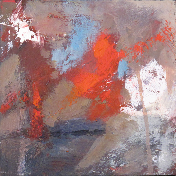
"Brio"
6x6x3/8", oil on textured board
I don't actually remember when I did this. Sometime in the last six months, I would think. But I like it. I'm not sure why. And I think this is why I keep doing abstracts.
Hmm. OK, let's get rational, here. It's mostly low key, but with pops of color. It has a full range of values, including difference values of the same hue. The composition is pretty good. If I were to find fault, it might be that too many of the shapes are the same size, but since it works for me anyway, let's just say it breaks that rule.
Anyway, I might have trouble selling this one.
I don't actually remember when I did this. Sometime in the last six months, I would think. But I like it. I'm not sure why. And I think this is why I keep doing abstracts.
Hmm. OK, let's get rational, here. It's mostly low key, but with pops of color. It has a full range of values, including difference values of the same hue. The composition is pretty good. If I were to find fault, it might be that too many of the shapes are the same size, but since it works for me anyway, let's just say it breaks that rule.
Anyway, I might have trouble selling this one.
Friday, June 22, 2012
"SPAO"
NFS - 24x20x1.5", acrylic and mixed media on canvas
I'm really enjoying using the cardboard. It gives wonderful texture, especially when glued down and then ripped off. Also, sometimes it has a stowaway, such as white paper on the reverse, or tape that's left flapping (which appears in this piece). Mind you, I'm a little cautious of being trite. There are textural effects that are used too commonly, and cardboard might be one. We'll see. Speaking of effects, I do like the one you can see on the right of putting tape down, adding paint, letting it dry, then pulling it up. I don't think I've done that since college.
Compositionally, this was a bit of a conundrum. You can see it if you use your hand to hide the block in the lower right corner. The painting then becomes more amorphous, consisting mostly of dripping colors. The block gives it structure. But after I put it in, it still seemed too obstructive and obdurate. Eventually I added the circles, and that helped. The fact that they're not in a straight line, and, in fact, that they mimic the curve of the cardboard across the top, adds a bit of swirl to the picture.
And, FYI, if you're wondering where the name comes from, it's a bit of text in the upper right quadrant (see the picture, below; you might need to click it). I like the name because names are hard. They can limit a picture by telling you what I meant you to see, which forces you to interpret it a certain way. This was just handed to me and leaves it wide open. I hope.
Wednesday, June 20, 2012
"Erupt"
6x6", oil on canvas board
So, mostly I do large abstracts and small still lifes. Don't know why. It's what feels right and that's how I've chosen to paint: Doing what feels right.
But recently I decided to try more small abstracts. I figure I'll still get the benefit of the small still lifes: You do more paintings, and thus get more lessons, in a smaller period of time; and you're not risking much in materials or personal judgment because there's not much investment. But, strangely, I also like them for a couple of other funny reasons: I get to hold the board with one hand and move it around and turn it, and the brush or knife with the other, and they interact like you were putting frosting on a cupcake. It's very satisfying. Also, I use up paint on my palette. I even find that mildly dried-up paint can give good texture.
And this is one such, with wonderful areas of texture: paint, scraping, dragging.
Finally, another thing I like about the small paintings is that I can go overboard on the color. A big painting full of hot colors can be overwhelming. But a 6x6" balances the color with the size. I'm imagining this one at, say, 48x48" and it could take over a room. Of course, maybe that's good...
Monday, June 4, 2012
"Traces"
24x30x1.5", acrylic and mixed media on canvas
So, while I've been working on the small skill-builders, I've also been doing some work on my larger textured abstracts. I don't really know how the two styles relate to each other. I figure that I should do what I feel inclined to do, and that varies. This one has sand or stucco patch, cardboard, and some lines created by putting white glue on the cardboard and using it sort of like a stamp. I think I also used some marble dust to give it that matte look.
I set this up to be extra large because the texture really is a huge component, and it's harder to see in a photo. Below is a detail from the upper right corner that shows all of the elements. You can click it to see it even bigger.
To be honest, this one sat there in a near-finished state, quite patient, really, until I decided it was time to finish it up. It was fun.
Friday, March 30, 2012
"Trajectory"
6x8", oil on canvas board
I use a glass sheet to I put out my paints on. It's next to my easel, on the drawing table. Along the back of the table is a row of smaller display easels, and I've put various little canvases there. There are little canvas boards, and also some bits of unrolled canvas wrapped around a piece of plexiglas. Some might be unfinished paintings I started a few years ago that never worked for me and have been collecting dust. Others are just bits of canvas that aren't fit for stretching, so I might as well paint on them. Maybe I can put them in a frame or something.
Why did I put them there? For two reasons. The first is that I wanted something to experiment on. Like, what happens if I add some marble dust to my paint? Or what happens if I put down some thick paint for texture, let it mostly dry, then scrape it? Which brand of water soluble pencil works best on wet paint? Or how about if I scribble with an oil pen and then paint over that? What if it's RED oil pen?
But I mentioned two things. The other thing is that I'm kind of cheap, and I hate seeing paint go to waste. Sometimes I have a pile of paint and it won't work on my current painting. So I smear and scrape it onto one of the little canvases. The biggest benefit (besides the cheap thing) is that I'm not risking much, so I can cut loose. It's pretty hard to loosen up when you're working on a 36x36" canvas. I mean, you CAN, but it's not the same. I guess there's another benefit, which is that paintings that weren't going anywhere are now becoming useful. It's fun to paint over an existing image and see what happens.
So, this was one of those small canvases. And I like it. I'm not sure why. Maybe I should try more neutrals. I did spritz it, and you can see the drippies at the bottom. Love those. I'll admit that there's one part of it that seems a little wacky, but I'm going to see if anyone else picks it out.
Anyway, that was a long story, but I put it out there in case anyone else wants to set up small canvases to play on.
This one is now framed and hanging in my house. I don't do that for a lot of my paintints, for some reason. So, cool.
Thursday, March 8, 2012
"No Warning"
18x36x1.5", oil on canvas
This is another like the one I posted a couple of days ago: Warm neutral colors with a large area that lacks detail but actually has a lot of texture. I also did this one with a lot of marble dust. At the top I put in some dynamic elements because it just looked too static otherwise. To me, at least.
That "To me, at least" is a funny question. I'm wrestling with how to gauge my paintings. The easy answer is to use my own judgment or follow my heart, etc., etc. The trouble is, I have a couple of paintings that really don't do much for me, but other people seem to like them. Are they being honest, or gently kind and supportive, or is my perception out of whack? And if they're right, do I go public with the paintings? Keep them in my stack and wait? Similarly, I have a couple of paintings that seem like they're executed just fine, but the content doesn't do anything for me. I haven't gone public with any of these paintings because they seem to lack something. Maybe I should paint over them.
Don't know. I think I'll take one or two back to my painting group and talk about it.
Tuesday, March 6, 2012
"Inconspicuous"
24x30x1.5", oil on canvas
This doesn't look like something I'd do, but I really like it! (And I'm not sure what to make of that.) Normally I paint in saturated colors, and it's literally hard for me to tone that down. This one is mostly cool and warm neutrals, with a little black and red. And white. It took courage to scribble in the black. It's very exposed -- right on the white canvas -- and I just hauled off and scribbled and didn't know how it would come out. You have to do that without reservation, because if you try to be careful, it will look like it. There are also some cool drips going down. I put a lot of marble dust in the paint, and it was almost like clay. Then, since it's water soluble oils, I sprayed it with water, and the heavy drips crawled down the surface. I like it when my work uses naturally occurring events. Things feel more organic that way.
I'm getting up the courage to paint bigger. More later.
Monday, November 28, 2011
"Caldera"
20x20x1.5", oil on canvas
I've been studying with Melinda Cootsona the last month or two. She's a marvelous teacher who does abstracts and figurative abstracts, both of which I'm interested in. Her classes are small -- maximum of four people -- and held in her studio. Because of the small size, she's able to really see how we work, and help with the process. For example, the other day I got snarled in poking at a specific part of a painting, and it didn't improve? She could see that I needed to change something, and suggested that I use a bigger brush. Boom! I was past it.
The painting on this page came from a process that she works with: You start by building an abstract painting, adding layers and depth and richness. Then, if you can find the suggestion of a figure in it, you can make your painting into a figurative abstract. On the other hand, you might find that you like the abstract that you did. This was one of the latter.
Subscribe to:
Posts (Atom)