Friday, April 1, 2011

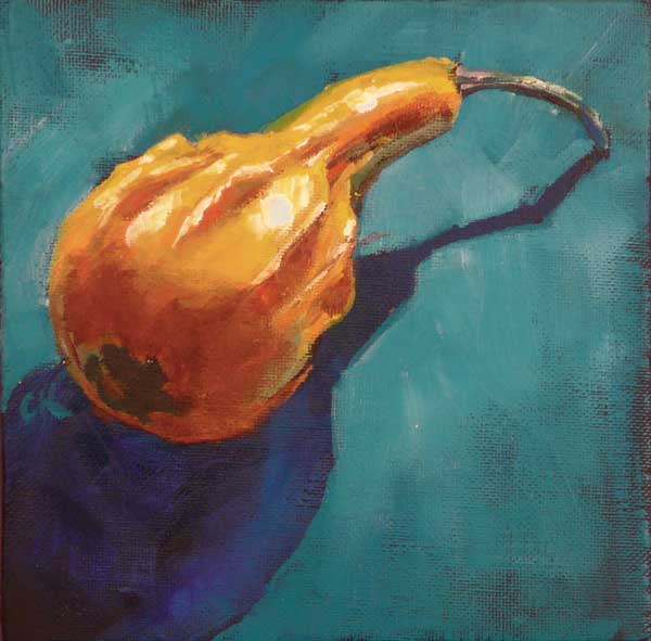
"Gourd on Purple"

6x6", oil on canvas board

The last of the gourd paintings. I think this gourd is still around, but all the colors have faded. It hasn't gone bad, though, and might be interesting to paint again. The challenge that this painting posed was that the colors were so different that I forgot to check for values, and, sure enough, they'd averaged out and gone muddy.

It's interesting to look at paintings that you think don't succeed and see if you can figure out why. Common reasons for me are values (as in this painting), drawing problems (where something doesn't look right), and having too many things of the same size without something else to add interest. Maybe that last thing is composition, but that word covers a lot. Of course, those are just a few of the key elements of visual imagery.

Friday, March 25, 2011

"Apple Bananas"

6x6", oil on canvas board

This was another painting done when we were in Hawaii in January (the papaya paintings were the earlier ones). In all cases I seem to have used an orange and purple background and yellow fruit. Bananas are fun because they're kind of faceted. So I had to figure out the variants on the native color. Then the variant with the reflected orange. Fun stuff.

Saturday, March 12, 2011

"Bottoms Up"

6x6", oil on canvas board

I thought I'd do a painting with more subdued colors. I've noticed that I really like hot colors, which is fine for the small works. After all, when it's only 6x6" or 8x8", it might need more punch. But I was finding that I didn't know how to do something more low key. Hence some practice. I'm also exploring fuzzy edges.

Wednesday, March 9, 2011

"Jostling"

8x8x0.5", oil on canvas board (with hanger slot)

This one felt good to paint. That's important to me. I've discovered that painting isn't just about what I produce, but how I feel as I'm producing it. I can find fault with some of the details, but it has a looseness that I like.

Monday, March 7, 2011

"Proboscis"

6x6", oil on canvas board

Another in my recent gourd series. Hey, I like shadows. And they make cool negative space.

Saturday, March 5, 2011

"Thai Round Eggplant"


6x6", oil on canvas board

I found these at my local grocery store. They were only about three inches across, and I was utterly charmed by them. They also look a lot like some small round tomatoes I painted long ago. There's another thing I noticed with this painting, which is that it's dark on a light background. Lots of my paintings are the other way around, but that gives this one some kind of buzz.

Saturday, February 26, 2011

"They're Papayas"


6x6", oil on canvas board

In my last post I mentioned painting two papayas. This is that painting. I liked the texture in the skin. At first I fought the fluorescent green, then I decided I really liked the effect, especially near the purple and red. This is one of the benefits of these little paintings: You can go nuts with the color. If you want.

Friday, February 25, 2011

"Papaya Value Study"

 
8x6", oil on canvas board

So, I had two papayas. And I'd already done a painting of them (I'll post it later), then decided to do another, but vary something. One way I do that is to change the colors but not the values. This is because of the truism in representational painting that says that it doesn't matter what color something is, as long as the value is correct.

However, I have notices a couple of things:
  • Thing 1: It helps to have a good amount of the actual color of the object. So, in this case the orange color kind of grounds it.
  • Thing 2: In the pale areas, you often end up with pastel colors. Yep. If you lighten red, it turns pink. Pale versions of blue, green, purple, all look pastel. 
  • Thing 3: Painting this way might be a sneaky method to hide a bad composition scheme. Now, if the painting is still interesting and attractive, it might not matter.
  • Thing 4: Use the B&W setting on your digital camera, and keep low standards for exactness of values.
Oh yes. My other possible name for this piece was Psychedelic Papayas. Heehee.

Tuesday, February 15, 2011

"Cohere"

Not available.

36x24x1.5", acrylic and mixed media on stretched canvas

This one is darker and more dramatic than most of my work. It was built on a painting that I couldn't bring home (finish successfully), so there's some depth to it. The big black shape is fabric (T-shirt) that I glued to the canvas and around the edge. I put a second, smaller piece in the upper right. And those drip shapes along the middle are kind of interesting. In a previous incarnation of this painting, I had played with water-soluble oil pastels. They ended up repelling water in the next layer. I might have to play with this.

Sunday, February 13, 2011

"Reticulate"

10x30x1.5", mixed media on stretched canvas

A friend sent me some gauze, and I decided to use it in a painting. I took it to my textured abstract class, along with a canvas that I had basecoated black. The teacher Stella Zhang, kept me from going haywire with colors. This is my tendency. I like Hawaiian shirts, and, as my husband likes to say, my favorite color is loud.

So I put white glue on the canvas and draped the gauze, and Stella made me stop there. Well, we did a little bit of black dry brushing around the edge. Back at home I tried things: tore up little bits of colored paper and stuck them in the gauze, and it really didn't want much. So I stopped.

I think it would have lost a lot of texture if I had gone in with too much color. Good eye, Stella.