Thursday, December 31, 2009

"On the Vine" redux

Connie Kleinjans still lifesOn the Vine, 6x8", oil on canvas board

Gotta get one more in before the month and year change. :)

This is another redone painting. At the bottom of this post you can see it as it originally looked when I posted it in May of 2008. It was fine. But there was nothing that really grabbed me about it. So I redid it. First, it looked like this:

Connie Kleinjans still lifesBut it didn't seem right. It was too swirly, because of the shape of the tomatoes. Now, in my color experiments, I seem to keep the original color of the objects in the well-lit portions, and add the creative colors in the shadows. And that seemed a bit bogus, so this one sat on my shelf. Then, a few days ago at the grocery store, I saw another set of yellow tomatoes on the vine. I bought them and used them as a basis to clean this one up. I'm now happier with it. Interestingly, I kind of like the shadows on the table top. I enjoy the effect of cutting in, and I did that with successively lighter colored paint. If I vary the paint color in any area rather than keeping it smooth and matte, it makes it look richer.

FYI, here's the original painting:

Connie Kleinjans still lifesI'm working on doing a 6x6 a day for five days. I'd love to be able to do the daily thing, but it seems like I can't. But five days seems doable. They'll be appearing in the next week or so.

Wednesday, December 30, 2009

Texture paintings

Connie Kleinjans abstract art
Texture 1, 9x12",
mixed media on gessoed masonite


Connie Kleinjans abstract art


Texture 2, 9x12",

mixed media on gessoed masonite


Connie Kleinjans abstract art


Texture 3, 9x12",
mixed media on gessoed masonite


Connie Kleinjans abstract art


Texture 4, 9x12",
mixed media on gessoed masonite


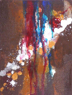
I've been meaning to post these for awhile now. They came out of my first abstract period. (I say "first" because I can feel that I'll return to it again, probably in a slightly modified form.) I was experimenting, so I laid out a few panels at once and did slightly different things on them. One thing I was working on was using earth tones. I tend to like saturated color -- hey, I wear Hawaiian shirts a lot -- and I actually get tired of them sometimes. Does that make sense? It's as though I'm tired of the normal colors and I wish they'd invent new ones. Well, of course, they exist; they're just not in tubes.

As I look at these, I'm noticing that even my dark neutrals are pretty saturated. I must go find some acrylic sketches I did with weird greyish greens and yellows, and brownish reds. At least, when I feel pulled to doing abstracts again.

Sunday, December 20, 2009

"Purple Shadows"

Connie Kleinjans still life12x9", oil on stretched canvas

I had meant to do another painting in my recent series of paintings with unusual colors in the right value. But I liked the direction this one was taking, so I went with it. I threw some purple in the shadows because I like green and purple together. I should also mention something funny: Leading the viewer's eye is so important that I spent some time aiming the apple stems when I was creating the set-up.

Initially, this one didn't have the striped cloth; it had a blue-green rectangle where the cloth now is. But as I started to conclude things, it didn't feel complete. So I found a striped dish cloth and had a lot of fun working out what its colors would be in shadow. Next time I might add more wrinkles to the cloth, for interest.

So, you know how some paintings paint themselves and you're just along for the ride? And other paintings are fighters? (I sure wish I knew what caused that.) This painting was not a fighter -- although I struggled a bit with the dark underpainting -- but the JPG sure was. I use Photoshop and have done a lot of color tweaking, and don't know why this one was hard. But I haven't taken the time to learn about gamuts and color profiles. Maybe I should do that sometime.

Overall, I'm pretty happy with this. Here's what it looked like after the block-in. (It's not a really good photo, but it was quick 'n' dirty.) There's so often something I like about this phase. Maybe it's the looseness; maybe it's the abstraction, like the mix of rough painting around the sketchy orange lines.

Connie Kleinjans fine artAlso, I was recently blog surfing artists, and ran into this excellent post by Jeff Mahorney called What I've Learned (after 120 paintings). The entire thing is well worth reading, but this is the part that struck me:
If there is one important thing I learned about painting this is it: Learn to tolerate the negative thoughts and feelings. ... Building up a tolerance and acceptance of those negative thoughts and emotions along the way is the greatest and most useful thing I've learned. Often when I am painting and about 45 minutes into it, my head might says "You're terrible, you should give this whole thing up" and I then feel the frustration or despair that comes along with that thought. But by now I'm used to it and I say,"Ah there you are. Come have a seat. You are welcome here, but we ARE going to finish this painting".
There's something so beautifully Zen about allowing the thoughts, but moving forward anyway. You should never believe everything you think.

Wednesday, December 9, 2009

"Bowl of Mandarins"

Connie Kleinjans Fauvist still life9x12, oil on stretched canvas

I keep learning from this process. So, I'm looking for a wide range of values in all the colors. To get pale values, I have to add a lot of white. That seems to make the colors look chalky. I walked past this in the semi-dark and noticed that the pale colors jumped out. I think I'll try Zinc white (also known as mixing white) and see if that makes a difference. Titanium might be too stark.

Another solution might be to make a monochrome underpainting first, then go on with colors. I'd really have to learn about transparency!

As far as the painting itself, it seems like another riot of color. I think I mostly kept the orange color for the bright parts of the fruit, since dark orange is brown, and it's more neutral than I want. Also, it's a little cartoon-like, although that's a matter of taste.

Hmm. Neutrals. Neutrals. So far I've found that they sap the energy. I'll have to play with that.

Thursday, December 3, 2009

"Scattered Apricots," redux

Connie Kleinjans Fauve Still Life6x8", oil on canvas board, sold

This is another re-done painting. It's really satisfying to take something that just didn't work for you and turn it into something a lot more interesting. FYI, here's the painting as it originally appeared:

Yes, the new one is more interesting to me.

One of my challenges on this one was to learn about how red works. It really does add heat. If you have shadows in a dark neutral, adding red can make them look like a light is glowing from the inside. It's a powerful color.

At the moment, I'm finding that I first do the painting in colors resembling reality. Then I start to muck with the colors. I think ideally I'd just do the painting in creative colors right from the outset.

I'm also still trying to figure out what a palette is in this case. In the original, it was pretty much blue and orange. But once I added greens and purples and reds and pinks to the orange, the palette widened. It's fun, but the paintings are in danger of looking too much like each other. I'd have a broader skill set, and more tools, if I learned how to lean the palette in different directions. I might be doing it intuitively; check out the cherries two posts ago.

Anyway, this is still way fun. :)