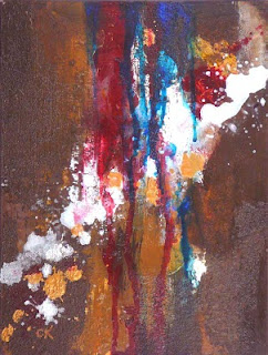
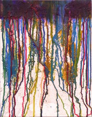
Thursday, December 31, 2009

"On the Vine" redux

Connie Kleinjans still lifesOn the Vine, 6x8", oil on canvas board

Gotta get one more in before the month and year change. :)

This is another redone painting. At the bottom of this post you can see it as it originally looked when I posted it in May of 2008. It was fine. But there was nothing that really grabbed me about it. So I redid it. First, it looked like this:

Connie Kleinjans still lifesBut it didn't seem right. It was too swirly, because of the shape of the tomatoes. Now, in my color experiments, I seem to keep the original color of the objects in the well-lit portions, and add the creative colors in the shadows. And that seemed a bit bogus, so this one sat on my shelf. Then, a few days ago at the grocery store, I saw another set of yellow tomatoes on the vine. I bought them and used them as a basis to clean this one up. I'm now happier with it. Interestingly, I kind of like the shadows on the table top. I enjoy the effect of cutting in, and I did that with successively lighter colored paint. If I vary the paint color in any area rather than keeping it smooth and matte, it makes it look richer.

FYI, here's the original painting:

Connie Kleinjans still lifesI'm working on doing a 6x6 a day for five days. I'd love to be able to do the daily thing, but it seems like I can't. But five days seems doable. They'll be appearing in the next week or so.

Wednesday, December 30, 2009

Texture paintings

Connie Kleinjans abstract art
Texture 1, 9x12",
mixed media on gessoed masonite


Connie Kleinjans abstract art


Texture 2, 9x12",

mixed media on gessoed masonite


Connie Kleinjans abstract art


Texture 3, 9x12",
mixed media on gessoed masonite


Connie Kleinjans abstract art


Texture 4, 9x12",
mixed media on gessoed masonite


I've been meaning to post these for awhile now. They came out of my first abstract period. (I say "first" because I can feel that I'll return to it again, probably in a slightly modified form.) I was experimenting, so I laid out a few panels at once and did slightly different things on them. One thing I was working on was using earth tones. I tend to like saturated color -- hey, I wear Hawaiian shirts a lot -- and I actually get tired of them sometimes. Does that make sense? It's as though I'm tired of the normal colors and I wish they'd invent new ones. Well, of course, they exist; they're just not in tubes.

As I look at these, I'm noticing that even my dark neutrals are pretty saturated. I must go find some acrylic sketches I did with weird greyish greens and yellows, and brownish reds. At least, when I feel pulled to doing abstracts again.

Sunday, December 20, 2009

"Purple Shadows"

Connie Kleinjans still life12x9", oil on stretched canvas

I had meant to do another painting in my recent series of paintings with unusual colors in the right value. But I liked the direction this one was taking, so I went with it. I threw some purple in the shadows because I like green and purple together. I should also mention something funny: Leading the viewer's eye is so important that I spent some time aiming the apple stems when I was creating the set-up.

Initially, this one didn't have the striped cloth; it had a blue-green rectangle where the cloth now is. But as I started to conclude things, it didn't feel complete. So I found a striped dish cloth and had a lot of fun working out what its colors would be in shadow. Next time I might add more wrinkles to the cloth, for interest.

So, you know how some paintings paint themselves and you're just along for the ride? And other paintings are fighters? (I sure wish I knew what caused that.) This painting was not a fighter -- although I struggled a bit with the dark underpainting -- but the JPG sure was. I use Photoshop and have done a lot of color tweaking, and don't know why this one was hard. But I haven't taken the time to learn about gamuts and color profiles. Maybe I should do that sometime.

Overall, I'm pretty happy with this. Here's what it looked like after the block-in. (It's not a really good photo, but it was quick 'n' dirty.) There's so often something I like about this phase. Maybe it's the looseness; maybe it's the abstraction, like the mix of rough painting around the sketchy orange lines.

Connie Kleinjans fine artAlso, I was recently blog surfing artists, and ran into this excellent post by Jeff Mahorney called What I've Learned (after 120 paintings). The entire thing is well worth reading, but this is the part that struck me:
If there is one important thing I learned about painting this is it: Learn to tolerate the negative thoughts and feelings. ... Building up a tolerance and acceptance of those negative thoughts and emotions along the way is the greatest and most useful thing I've learned. Often when I am painting and about 45 minutes into it, my head might says "You're terrible, you should give this whole thing up" and I then feel the frustration or despair that comes along with that thought. But by now I'm used to it and I say,"Ah there you are. Come have a seat. You are welcome here, but we ARE going to finish this painting".
There's something so beautifully Zen about allowing the thoughts, but moving forward anyway. You should never believe everything you think.

Wednesday, December 9, 2009

"Bowl of Mandarins"

Connie Kleinjans Fauvist still life9x12, oil on stretched canvas

I keep learning from this process. So, I'm looking for a wide range of values in all the colors. To get pale values, I have to add a lot of white. That seems to make the colors look chalky. I walked past this in the semi-dark and noticed that the pale colors jumped out. I think I'll try Zinc white (also known as mixing white) and see if that makes a difference. Titanium might be too stark.

Another solution might be to make a monochrome underpainting first, then go on with colors. I'd really have to learn about transparency!

As far as the painting itself, it seems like another riot of color. I think I mostly kept the orange color for the bright parts of the fruit, since dark orange is brown, and it's more neutral than I want. Also, it's a little cartoon-like, although that's a matter of taste.

Hmm. Neutrals. Neutrals. So far I've found that they sap the energy. I'll have to play with that.

Thursday, December 3, 2009

"Scattered Apricots," redux

Connie Kleinjans Fauve Still Life6x8", oil on canvas board, sold

This is another re-done painting. It's really satisfying to take something that just didn't work for you and turn it into something a lot more interesting. FYI, here's the painting as it originally appeared:

Yes, the new one is more interesting to me.

One of my challenges on this one was to learn about how red works. It really does add heat. If you have shadows in a dark neutral, adding red can make them look like a light is glowing from the inside. It's a powerful color.

At the moment, I'm finding that I first do the painting in colors resembling reality. Then I start to muck with the colors. I think ideally I'd just do the painting in creative colors right from the outset.

I'm also still trying to figure out what a palette is in this case. In the original, it was pretty much blue and orange. But once I added greens and purples and reds and pinks to the orange, the palette widened. It's fun, but the paintings are in danger of looking too much like each other. I'd have a broader skill set, and more tools, if I learned how to lean the palette in different directions. I might be doing it intuitively; check out the cherries two posts ago.

Anyway, this is still way fun. :)

Monday, November 30, 2009

"Cots in a Bowl," redux

Connie Kleinjans still lifes8x6", oil on canvas board, sold

Amongst the small still life paintings I did in 2007 and 2008, a number of them just didn't tickle my fancy. So, with my recent interest in experimenting with colors but remaining true in value, I decided to try repainting them. It seemed like a good way to learn about the Fauve colors, while working on an existing composition, with existing colors and values. (Are these Fauve colors? I don't know.) This was a painting of apricots from May of 2008.

Each one I've done (and there are a couple that I'm not ready to blog yet) teaches me something about how to do this, and how color works. For instance, in this one, even though I'm using non-standard colors, I need to pay attention to how they interact. Note that the further wall of the bowl is mostly green. I tried painting it with a mix of colors including blue and purple, and it just wanted to blend into the background. It had to be a color that separated itself from the purple. By the same token, if I made it too red or orange, then it wanted to interact with the fruit. In fact, for awhile the fruit was too pastel and sweet, and it looked weirdly transparent against the light colors of the bowl. Yeah, this one was a bit of a fighter.

Thursday, October 29, 2009

"Still Life with Cherries"

Connie Kleinjans still life10x8", oil on canvas board

OK, yeah, this is getting closer to a more interesting painting done in non-realistic colors. Note that, as I mentioned in my last post, the items themselves need to have some of the local color of the item. I think. Would these still look like cherries if they were all blue? And the guidelines for painting still apply, of course. Things like having the focal point away from the middle, having some rest areas as a break from the dynamic areas.

I went looking for a book on how to use nonrepresentational color, and I couldn't really find one. I'm looking into the Fauvists, especially Matisse and Vlaminck. The closest current book I could find was Brilliant Color by Julie Gilbert Pollard. She does, indeed, use intense colors. Where I might differ philosophically from her is in having a dominant and focal color. The colors in this painting are blue-green, white, and alizarin crimson. It's rather cold, with a little warmth in the plate.

I've been feeling recently like I need to have more of a concept when I create a painting. Last night I was looking at some of my still lifes from a year ago, and I discovered that, whether I knew it or not, I did, indeed, have a concept. Leaned against books on the bookshelf to my right I can see paintings where I explored seeing shapes through colored glass, how a glass vase looks with a highlight hitting the inside of it, how different the colors of tomatoes can be, and how to do a traditional still life but add sunglasses. This is kind of liberating. I'll have to go look at my abstracts.

So, at the moment I don't know how to classify myself as a painter. I also don't know if I need to. What the heck.

Wednesday, October 28, 2009

"Odd Orange Out"

Connie Kleinjans Still Lifes8x10", oil on canvas panel

A college art teacher once said to me, "Connie, when are you going to stop experimenting?" My amazed response was, "Never!" Now, I know what he meant: At some point it's good to choose a specialty and pursue it, specialize in it, become expert at it. But I just don't seem to be able to do that. At least, not yet. The subtitle of this blog is "Painting What Feels Right." In an earlier post I think I spoke of the amazing selfishness of art: You can't paint from someone else's vision or perspective. Well, you can try to channel them, but hey. So the only thing you can do is to stick with what's authentic. And you get to define that.

So, I recently saw some Fauvist style paintings and became fascinated with wacky color. I also remembered a truism I've heard: "If you get the value right, you can paint it any color you want." Wow. Color doesn't matter, value does? OK, we know this, right? What if you push it?

So I did. First I did the apple study, below. Then I did the oranges, above. (I like that painting better, so it's at the top.) It reminded me of the still lifes I was doing a year or two ago, but with strange colors.

Connie Kleinjans fine art"Apple Study," 8x10" oil on canvas panel

What did I find? Well, I'm still figuring it out, but I think I discovered a few things:
  • Color matters a little. Like, in the painting of oranges, it did need some orange color. As it is, it could very well be pink grapefruit.
  • A digital camera is really, really handy. Yes, I have a piece of red acetate, but that darkens everything. The digital camera isn't perfect but it does give good value data.
  • I'm able to loosen up a lot if I paint this way. It's way fun.
I'm noticing a lack of neutrals in these and many Fauvist paintings. I'm wondering where that will go.

OK, back to the topic at hand: Should I specialize? Maybe some day. I feel like I'm collecting a wide variety of tools and means of expression, and that maybe at some point I'll find a concept that I stick with for a long time. At the moment, though, all I can do is what is right for me. And these are fun.

Sunday, October 4, 2009

"Churn"

Connie Kleinjans abstracts9x12x1.5, oil and cold wax on couched hardwood

My mojo is back. Or at least within reach. You know what I mean? You can feel it out there, and you just might have a hold on it. I'm not quite sure yet, since I'm coming back after some excitement (OK, tenth wedding anniversary trip to Paris) (and some other stuff), but things are starting to gel again. I'm playing with the cold wax techniques from the workshop (see my summer posts) as well as my prior methods. Soon I'll start to meld them.

Meanwhile, this is another painting from that workshop. I love purple and green (OK, greenish-yellow) together and this also has some delicious texture. After I got it to a point I liked, I burnished it. That removed lost some of the intensity from the color, so I went back in and boosted that. Still learning, still playing.

I'm also having some serious fun playing with intense textures, and I'll post some of those soon. Nice to be back.

(I'm probably not supposed to use words like "mojo," am I? I mean, I'm a middle-aged white-bread type. But it felt right.)

Monday, August 31, 2009

"Amber"

Connie Kleinjans abstract paintings8x10x0.75," oil and cold wax on couched board

As mentioned in an earlier posting, I invited Rebecca Crowell to California to teach a workshop. Her paintings are wonderfully textured abstracts with the look of age and depth to them. That seminar was at the end of July, but between vacations and surprise trips, I haven't made time to work much more with her techniques.

But the other day I revisited some of the work I did during the workshop and decided that I liked this one as it is. Yes, it can be hard to know when something is done, of course, but this didn't ask for any more work. So here it is. I did buff it a bit to bring out the texture.

Hmm. Actually, I did make one final change. I had been looking at it with the red part at the top. Just how my mind's eye saw it. Then, just for grins, I turned it over. The red part, being darker, anchored it better. The amber part then looked more richly texture. It was interesting, and, as I think I've said before, realistic painters can't do this. Here's how it looked the other way, in case you're curious. I welcome opinions.

Sunday, August 30, 2009

SBAWCA show

I recently joined the SBAWCA, which is a part of the Women's Caucus for Art, a national organization celebrating women in the arts. The SBAWCA is the branch in my local area. Today the group opened its 20th anniversary show, and two of my pieces were in it. They looked gorgeous! When you first walked in the door, the first thing you saw was a wall of paintings, among which was Abyss (here's my original blog post):


Connie Kleinjans abstract painting
Once you stepped into the room and looked around, you saw that And So... (see my last post) had a wall all to itself. It looked wonderful, and glowed proudly:


Connie Kleinjans fine art
And, yes, I totally got the book for the show, which contains the paintings and my statement about each one. The show runs until September 19. The location is Art Object Gallery, at 592 North Fifth Street, San Jose. It's Japan Town, so it's a fun area to visit.

This is the first national arts organization I've joined. I admit I still don't know how they work, but I saw work from a lot of talented women artists, and I'm looking forward to learning and networking.

Wednesday, August 26, 2009

"And So..."

Connie Kleinjans paintings36 x 60 x 1.5", acrylic and mixed media on stretched canvas

This piece and another of mine, Abyss, will be in the SBAWCA show starting this Saturday, August 29, in San Jose, CA. Information is here. SBAWCA is a local branch of the WCA, or Women's Caucus for Art, a group I joined recently.

What to say about this? Well, I got interested in circles, and learned about the Enso. This is an image strongly associated with Zen. Its simplicity is profound, and monks who do brushwork will use it as a practice: create a perfect circle with one brushstroke. More at wikipedia. I couldn't name this "Enso," since it's not one brushstroke, and the monks have an entire discipline that I have too much respect for to use the name. So the name is evocative to those who know, but still has a flavor or sense of movement. Also, it turns out that the circle fascinates a lot of people, who attach metaphorical meanings to it, or analyze it mathematically, or associate it with shapes in nature. I'd like to do more. I have one in the works that is resisting completion. You know how that goes.

When I look at this, I'm reminded that they say "the simpler, the better." While I'm cautious of rules (someone will come along and break them and succeed), I can agree that there's something profound about simplicity

This is also the largest piece that I've done that isn't a theater flat. I have another canvas this size, and I got it so it would sit and mock me. OK, not mock, really. But it would encourage me to work larger.

Monday, July 27, 2009

Rebecca Crowell workshop

Wow, you blink and weeks and weeks go by. It's been busy recently, with a few summer trips, some non-art activities, and a workshop, so I haven't posted. But this post is about that workshop.

A few months ago I encountered the work of Rebecca Crowell, an artist who works in cold wax and has developed ways to build depth and richness through layers. Her work can remind you of old walls or ancient frescoes; it just has that deep, grounded feeling. So I emailed her, asking if she was planning a workshop on the west coast. She replied and said she didn't have one in the works, but was available. Being pretty much inexperienced at setting up workshops, of course I decided to set this one up. It was a lot of work, but it was wonderful! We had a total of eight students, all talented and passionate. And my gallery, Gallery 2611, proved to be a wonderful, bright space to work. Here's the set-up:

Oil and Wax workshopAs a teacher, Rebecca is a thoughtful and perceptive, balancing demonstrations and presentations with time to play with what we learned, and communicating with each student based on her personal concerns. I loved how the room felt when everyone was buried in her own work, and a focused hush descended. We also, interestingly, had scads of passers by come in, curious about what we were doing.

The workshop was three days, and the cold wax was dry enough to work over those days so everyone came out with finished or near-finished work. Here are two of mine that I think need a few more layers. But you can see that they form a good under layer for something rich and deep. The original jpg is pretty big, so if you click it you can see a lot of detail.

Connie Kleinjans abstract art
What's next? I can intuit that there are ways to combine Rebecca's approach with my texturing techniques. I have ideas swirling around in my head, and I now get to have the fun of playing with them.

Tuesday, May 26, 2009

"Spirsa"

24 x 18 x 0.75", acrylic and mixed media on stretched canvas

In my last post, I mentioned that I came out of teaching my workshop with two paintings that I liked, which was a bonus. This is the second one. When the earlier painting looked finished at Step 2 (I usually paint in three steps; see the last post), I needed another Step 2 painting that I could use in a demo and develop to Step 3. So I went home and created a tremendous mess. This one has some dry wall tape, in addition to the regular texture material (stucco patch, flexible patching compound). Then I took it to the second day of the workshop.

When it came time to discuss developing a painting, we used this as material for sharing ideas. So we kind of painted this as a committee. My purpose was to demonstrate simplifying a painting (in other words, you shoulda seen this before I simplified it). The students sat where they could see my easel, and we discussed different features of the painting and directions we could go in developing it. For instance, just right of center and a little up is a wonderful wrinkly section that we agreed looked like a dragon's head. I could have punched up the detail in it and made it a focal point. But it fought with the orange circle at the center of the spiral, left of center, so I attenuated it.

The whole experience was wonderfully fun: throwing ideas around, demonstrating what you can do with texture when you're putting a second layer of paint on it, figuring out what delicious little bits to sacrifice to the whole. I got to see how much the students really did know. I think I'll keep this exercise it as a feature of future workshops. I was initially kind of terrified of having to take a painting to completion. After all, I can't guarantee that any given painting will come out well. But if we all do it together then the learning happens whether or not the final result is ideal.

Thursday, May 21, 2009

"Phosus"

Connie Kleinjans contemporary abstract18 x 14 x 1.5", acrylic and mixed media on stretched canvas

I was fortunate enough at my workshop last weekend to create not one, but two paintings I'm pretty happy with. This is one of them, and it came about kind of by surprise. You see, I often paint in three steps: Step 1.) Apply the texture material. Step 2.) Add the foundation paint layer (this is usually a tremendous mess, lots of free form color applied any way I feel like). Step 3.) Take the tremendous mess and simplify it. I have to say, Step 3 can be difficult; Step 2 can result in wonderful passages where colors run into each other or trickle around the texture or whatever. But it's usually too busy. So in Step 3 I have to paint over parts of it, which can be heart breaking.

This one was a surprise because, at the end of Step 2, I didn't think it needed a lot of work. I figured it should need work, but I wasn't sure what to do to it. Eventually I did go in with some gold and pick out some highlights. And I had to go home that night and create another Step 2 painting for a demo the next day.

I have to say, though, that Step 1 and Step 2 are enormously liberating. You kind of put your logical mind on hold—well, after choosing your palette—and you enter the moment and just go on impulse. I should do something about that...

Sunday, May 17, 2009

First workshop: How it went

I finished teaching my first workshop today. This was the title:

Painting Fabulous Textured Abstracts
(or why the hardware store is your best friend)

(Later it occurred to me that I shouldn't have used the word "fabulous." No man would take a workshop with that in the title.)

Two people signed up for the workshop. On the one hand, I'm bummed not to have had a full group. On the other hand, it was nice to have a small, intimate group, especially for my first workshop.

Both days were hot. Saturday, Day 1, the German restaurant next door was having a beer garden in the back parking lot, so there was a lot of oom-pah music plus partying people. It was also a local open studio tour. So, on the whole, pretty busy. In fact, a bit overwhelming. And I hummed polka music for hours. Sunday, Day 2, was even hotter, and we agreed to start a half hour earlier. It was much quieter, and I played some Hawaiian slack key music on my iPod (no oom-pah!). Mostly we all developed the projects we started on Day 1. I did a demo that actually came out well! This was one of my fears: I can't always guarantee that I'll be able to create something good. Both days, people kind of ran out of gas an hour or more before the nominal end time. I can understand this; I've felt kind of overloaded at all-day classes. And the heat was really hard.

I learned a lot. There's one explanation I know I need to improve. Like, it's really hard to estimate how long things will take. Also, even when I give students the composition and the technique for applying paint, they can come out with really different paintings. And we did a few group discussions: One of us would want to talk about a painting, and we'd set it up on an easel and gather round. I loved those. They weren't critiques, per se, since it wasn't about what was wrong, but rather about what they wanted. I don't want to give students a solution, but, rather, give options or remind them of the color or composition guidelines.

And nice students! Willing to share experience and knowledge and enthusiasm. One of the students said she'd been looking for a class like this for years, and wants me to tell her if I ever give another workshop. That's really encouraging.

I'm content. I asked the students if they had enough information to take home and work with on their own, and they said yes, they did. This was good to hear, since at the end of Day 1 I could tell that not everyone was feeling successful. That was a bit hard. I really want them to feel empowered by the class. But Joyce Faulknor, one of the other artists at my gallery and also a teacher, said something that helped: All you can do is give them all you got. Then, even if it doesn't work for everyone, you know you did all you could.

Wednesday, May 13, 2009

"Archulos"

Connie Kleinjans contemporary abstractSOLD 30 x 40 x 1.5", acrylic and mixed media on stretched canvas

[UPDATE: I redid the picture of this painting. The earlier one dropped out a lot of texture, and the color was difficult, since I used metallic paint. If you want to see the texture, click the image. I also uploaded a larger JPG.]

It's been a busy time recently. I'm teaching my workshop this weekend, and also coordinating one with another artist for July. Specifically, I've invited Rececca Crowell to come to Northern California. Her wonderful paintings have amazing depth and texture, and I think I could learn a lot that might transfer to what I'm doing. Do check out her blog and web site. And let me know if you're interested in the workshop.

Meanwhile, although I'm probably in reasonable shape for my own workshop this weekend, I do need to finish up a few things. Got the syllabus in pretty good shape, the hand-outs either planned or done, detailed notes on supplementary information. Just need to finalize. So this post might be a bit short.

So, about this painting, remember my admiration for texture and depth? I keep finding new ways to use hardware store material to create that. In this piece, it had occurred to me that the textures I'm creating might look wonderful with metallic paint. So I used a flexible patching compound and dragged through it to create interesting bumps. And I added my beloved stucco patch. After a few interesting starts with bright colors, and a visit to Photoshop to play with composition, I developed it as you see it: lots of layers of paint, and lots of darker colors rubbed into the metallic color and catching the contours of the patching compound. I like how it looks old.

I'm also developing (or redeveloping) an interest in primitive symbols. This one seems sort of like Stonehenge. I have one in the works that has a circle. I'm looking into Hawaiian petroglyphs and ancient wall paintings, as well as patterns of water and totem symbols. They strike some sort of chord in me, and I'm listening.

Thursday, April 30, 2009

"Flurry" and "Trickle"

I've noticed that I've only blogged once this month. Why? Two reasons. Well, OK, three: ramping up for my new workshop; having a few paintings that just don't feel finished even though I don't know what to do with them; and having some Life Events happen (nothing serious). Now, about point 2, having paintings that don't feel finished, I think I need to just hunker down and finish them. But sometimes it's more fun to start something new. That is, until the old things start to pile up.

However, at the same time, I seem to have started a series. Now, I believe in serieses (is that a word?). I believe that by painting something a few times, but only changing one thing -- or maybe two things -- you learn a lot. The trouble is, when I've done them I've felt kind of bored. But strangely, in this case, I've had a specific goal, and it's been more interesting. Not that it's terribly exciting, mind you. It's a very simple composition I've seen a number of artists do, which is to have a dark band at the top, then fill the rest with texture. Here's my first one:

Connie Kleinjans contemporary abstracts"Flurry," 18x14x1.5", mixed media and acrylic on canvas

I kind of like it. It's both festive and pensive at the same time.

Here's the other one. What's different is two things: the color and the texture. The color is more triadic, and for the texture I decided to play with the surface for the drippies (or "Pollocks" as a friend suggested). In the first piece, above, I put the texture down with some diagonal troughs. You can see that some of the lines streak from upper right to lower left. I like it. It's a little like something in a storm.

But in the piece below, I tried a kind of X composition with the texture: It flowed toward the center, and then out towards the sides. I'm not sure it works as well. It's kind of splayed. Interesting in its own way, though.

Connie Kleinjans contemporary artistNFS. "Trickle," 18x14x1.5", mixed media and acrylic on canvas

I have the next one queued up, but I'm thinking I should wait until I've finished a few semifinished ones first. And make sure I'm prepared for my workshop. It should be scads of fun! There are still openings, if you're interested. Hmm?

Tuesday, April 21, 2009

I'm teaching a workshop!

There's been quite a bit of interest in the techniques I'm using for creating my abstracts, so I'm teaching a workshop. I'm kind of new to teaching, so I could use any help you can offer for getting the word out. Here's my blurb (do you like the title?):

Painting Fabulous Textured Abstracts
(or why the hardware store is your best friend)


Do you love richness and texture in your paintings? Do you want to experiment with multimedia in a way you've never done before? This fun, lively workshop teaches you to use materials from both the art store and the hardware store to create amazing abstracts. No prior experience needed! Just bring your adventurous spirit! Expect to go home with a minimum of two (and maybe more) abstract paintings.

When: May 16 to 17, 2009, 9:30 am to 4:30 pm
Where: Gallery 2611, 2611 Broadway, Redwood City, 94063
Price: $130
Need more information? Click here.

To sign up, email connie@ckleinjans.com
or call Gallery 2611 at (650) 364-2611

Tuesday, April 7, 2009

The Fire Eater

Connie Kleinjans contemporary art30 x 40 x 1.5", acrylic and mixed media on stretched canvas

12/2012 update: I first took this to a textured abstract class and mucked with it, then painted over it. It now looks like this.

It's been a busy time, getting myself settled in at Gallery 2611. I have some studio space there, yay!, but I needed to set that up. That meant a trip to Ikea, and two -- two! -- repeat trips to get missing parts. I also treated myself to a gorgeous new easel, and bought more paints, brushes, and texturing supplies. So I haven't made much time to paint.

However, I did this piece last month or so. I almost named it The Fighter, but the current title feels right (and almost sounds the same). But the reason I almost named it The Fighter is because it was one of those paintings that just had a mind of its own, and wasn't going to cooperate with any plans or concepts I had. I cajoled it, changed compositions, let it sit, revisited it, and, finally, here it is. I think maybe the struggle shows a bit, and I like that.

For those of you interested in art process, here's how I got to the final image:

Step 1: I wanted to play with my drippies (I really need a better name for those...), but on the diagonal instead of up and down. I played with a few compositions in Photoshop, along with a few palettes, and came up with this as my concept:

Background goes from dark to light, and the stripes are in a middle value, so they kind of merge with the background in the middle. I also looked at it the other way around:

That's a funny thing about abstracts: They are not glued to an orientation. I mean, seriously. Those of you who do landscapes or figure painting, do you ever rotate your work to see if it would look better oriented that way? Isn't that a bizarre concept? Well, kind of. Ultimately a work flies or falls based on the composition and we do often look at art from a different perspective to see what we can learn.

Step 2: I had a couple of nails on the wall, and I hung the painting so the drippies would go at an angle. I put another canvas underneath just to see what would happen with the drops that fell off this one. Here's the first version.

Frankly, meh! Not so good. The Photoshop version made promises I was unable to keep. (And if I'm wrong and you like it, tell me!) I think I thrashed for awhile at this point, and eventually decided I had to have a new concept.

Step 3: Now, one of my theories in making textured art is that no underpainting is wasted; it is merely source material and adds richness to whatever you put on it. Personally, I like success by definition. So, after "meh," a small explosion occurred and this emerged:

Kind of ghostly, kind of interesting, but, aughh! it still wasn't there. (Again, feel free to totally disagree with me. I'd like to think everything I touch is brilliant.) (Yeah, right. Maybe if I was Picasso.) You can see where the drip lines cross near the middle, though.

Step 4? Sadly, I didn't document the transition from the penultimate to the ultimate painting. But, like an earlier painting, I'm surprised at the iterations and how different they were. (And now, glad to have this record of it.)

End note: And interesting resource. I found a wonderful blog whose author talks straight to artists. It's Edward Winkleman's blog. He works out of Chelsea, New York, and gives wonderful, honest information, much of it useful to emerging artists. Here's a link to his excellent page on finding a gallery.

Thursday, April 2, 2009

My new gallery: Gallery 2611

(Me, in scruffy clothes, posing between Scissure, on my right, and Red, on my left.)

Well, I'm in a gallery. And, yes, I'm pretty excited about it. It's Gallery 2611, in Redwood City, CA, and I'm sort of a partner. So I have some additional studio space, and I've found a group of fun artists to hang out with. Hey, they're a kick in the shorts! If "Ain't Too Proud to Beg" comes on the iPod, dancing just might ensue.

Now, I live high on a hill with a taciturn man, and I've got my Jack Russell Terrorist for company. But I've been missing the people contact I used to get at work. I've also come to realize that I want to interact with other artists. Gallery 2611 seems to fit the bill. Also, two of the artists are experienced teachers, and they think people might be interested in my texture techniques, so they're encouraging me to teach a workshop. I'm aiming at mid-May.

Thanks, Joyce, Guy, Gary, Jackye, and Dianne, for letting me join you. Here are Joyce and Guy's websites:

Monday, March 16, 2009

"Rondus"

Connie Kleinjans contemporary art
NFS. 30 x 40 x 1.5", acrylic and mixed media on stretched canvas

The composition for this came to me while I was hiking, when I saw some cracked rocks. Of course, although I started with that notion, the painting developed a mind of its own. (Maybe they all do.) And as it developed, it contradicted a guideline I have that I've mentioned before: Mostly I find paintings are better if they're simpler. But when I had finished the textured underpainting, it was too simple. It needed something else. So I just added some shapes. I was a little concerned about them, since they're so, well, stark. But it felt right. One of my favorite parts is on the leftmost "rock," where I glazed in some yellow, then dripped the white paint through it whilst it was still wet. It picked up some of the yellow, and it's a cool effect.

So, I had an interesting discussion with a friend today (on IM). Two interesting points he made about abstracts were these:
  1. People viewing a painting seem always to make figurative stuff out of pure abstractions.
  2. And there's a strong desire to see something personal. It's the self-referential tendency.
Then he thanked all available dieties for the name Untitled. There was more, but I especially enjoyed those points. And the one where he encouraged me to trust my instincts.

Speaking of instincts, I used to be told that I thought too much. Could be. I have an obsessive streak. But I think that what came across as thinking was actually me trying to feel my way to an answer, and talking about it -- articulating my feelings -- helped. But the articulating seemed too cerebral, hence the "you think too much."

So, what, you might ask, does "Rondus" mean? I believe I found it in the derivation of a word meaning "round." And it felt right. I mean (and I kind of hate to admit this), my initial thought was that I should entitle this painting "The Jellyfish and the Moon." It's almost charming, but "Rondus" is better.

Wednesday, March 11, 2009

"Abyss"

Connie Kleinjans contemporary art30x40x1.5, acrylic and multimedia on stretched canvas

This painting instantly became a favorite. It has mood and depth. I named it Abyss because it reminds me of being under water, and the filtered light you see when you look up. Trite? Maybe. Was the movie long ago enough? Anyway, while developing it I had worked on a really textured underpainting, and it just wasn't right. Then I remembered the Keep It Simple, Stupid (KISS) rule. So I schlepped it up on my easel and had at it with my puddles of paint and rags and eye droppers, and even a brush or two. The more I simplified, the more I liked it. The orange and yellow parts left of center are about all that's left of the underpainting. Finally, not sure if it felt done, I rotated it to see it with different sides up (this is hard for realism painters to do). Once I got to this orientation I had that sudden "Yes!" feeling. Don't you love that bubble of excitement that rises through your solar plexis? (Of course, it doesn't do as much for my husband, which is useful to keep in mind.)

I haven't been able to paint as much recently. As I mentioned, I'm preparing to apply to a gallery or two. I don't have a lot of abstracts yet, but the number is growing. I've also been working on a web site; it will have a subset of the paintings here, since I don't know that I need to maintain two sites as exhaustively as I do this one. And I've been assembling an artist's statement and business cards and I'm working on a brochure. So, busy.

I had lunch with a wonderful plein air painter named Sandy Ostrau, who lives not far from me. Check her stuff out. It has great use of brushstroke and color, and she does that simplicity thing just wonderfully by doing a series of paintings in which she eliminates unnecessary detail. (Sounds like Strunk & White: "Omit needless words!") It actually makes me want to try redoing a few still lifes to see if I can simplify. This is a bit of a surprise, but not a shock. What I'm learning is that in making art you have to do what feels right.

If anyone has any hints on artist's statement, I could use them. Mine is a bit melodramatic right now.

Wednesday, March 4, 2009

"Lava"

Connie Kleinjans contemporary artSOLD 20 x 24 x 0.75" acrylic and mixed media on stretched canvas

This one became lava pretty much by itself. I was looking at the work of Brian Rutenberg, who does wonderful glowing paintings, and decided to try the technique on warm colors. Yeah, lava is pretty warm. I'm thinking of doing another piece sort of like it, but in cool colors to see what they say.

Well, I've spent a bunch of recent days battling simultaneously with two paintings that were fighters (as I call them). I brought one to a reasonable conclusion and will post it in the next few days. The other is on my wall, girding its loins for another battle. Then, of course, I did something that painted itself. More later.

In other news, I'm considering approaching one or two coop galleries around here (Silicon Valley). Does anyone have any experience with those? They sound wonderfully participatory, once you're in (it's a jury process). They ask you to pay monthly dues, staff the gallery one day a month, and occasionally do other tasks such as hanging shows or whatever you're good at. In return, at least one of your pieces is on display at all times, and they do promotions and shows. If they sell something, they take 30% rather than 50%. It sounds like a good way to learn about galleries, and I also figure it would be good to meet other artists, since I keep whining about how solitary it is high up on my mountain. So, any input is welcome.

Friday, February 27, 2009

Scissure - A reader's cool input

I got some intriguing email the other day from Judy, a self-professed "frustrated gallery-owner-wannabe." She loves to follow artists, and had some interesting feedback for me about Scissure, my last post. As she said, "I took the liberty of cropping this painting (I LOVE THE COLORS!), and I wondered what you think of it. It has so much movement, and I love both your original and my cropping of it. I’m an asymmetrical kind of character, I guess." I totally didn't mind her doing this, and here's her cropped version:

Connie Kleinjans fine artInteresting! I wrote back to her and said "In most cases I don't like exact symmetry either. There's a book called The Simple Secret to Better Painting, by Greg Albert, and his theory is that, in composition, you should never make two intervals the same. This applies to shapes, colors, values, etc. I tend to follow the 1/3 rule and put a fl point at one of the intersections of an imaginary tick tack toe grid placed on your painting. I violated that in this painting because, well, maybe at first because the center is where the colors fell in the original composition. But also, to me it seemed like with a monolith composition it asked to be centered. I could be wrong. The way you cropped it gives it a more organic feel."

I love that Judy wrote me, and I love that both croppings work. Judy, it was wonderful to hear from you.

(BTW, for the last few months I've been associating text with the image so that when you hover your cursor over it, a small message appears. No biggie. Just something fun.)

Tuesday, February 24, 2009

"Scissure"

Connie Kleinjans fine art30 x 40 x 1.5", acrylic and mixed media on stretched canvas

Taste in art is interesting, with this work being a case in point. I find it my most monumental piece yet, with a kind of a grandeur, but it's also a bit disquieting, because it makes me think of a wound (that was almost my first title). But it doesn't appeal to my husband Mike as much (not to say that he dislikes it, just that it doesn't do as much for him as for me). While I might choose to stick with my own sense about a painting, I honestly find his input valuable. First, I have not yet plugged in with a local art group, so my impulses and tastes are growing in isolation, with only input from Mike and the wonderful visitors to this blog. :) But second, Mike has never studied art. He's an engineer. So, to me, he represents both another perspective and also the audience.

That, of course, brings up the perpetual issue: audience. I don't know about you, but I sometimes find concern for my audience creeping in when I paint. Then I make decisions based on some concept of what I think will sell or will appeal to a lot of people, or something. But you can't do that! At least, not a lot. The point of creativity -- any creativity -- is to make it honest and make it yours. Recently I spent time just noticing when I was taking salability into account, even subtly. When that happened, my comeback to myself was, "Yes, but do I like it?" This can be hard for people (especially women?) who are raised to think of others, to keep the harmony. And it can also be hard because this is a kind of expensive hobby if I don't sell anything (I haven't seriously launched that effort yet).

Here's a nice quote from Art & fear (yes, they use the ampersand and the lower case on the front cover of the book):
Fears about artmaking fall into two families: fears about yourself, and fears about your reception by others. In a general way, fears about yourself prevent you from doing your best work, while fears about your reception by others prevent you from doing your own work.
So, going back to the beginning of this entry, if I ultimately need to make my art mine, why do I need input from others? Hmm. I haven't spent much time on this, but it feels like I need a little input to stay grounded and not float away in my own conceptual world. And, frankly, I'm insecure enough to need a little validation sometimes. So, perhaps (as in many things), the answer is the Middle Path, the eternal balancing act, yin yang. As they say, "Moderation in all things, including moderation."

But I do like "Make it honest, make it yours." Of course, maybe they're the same thing. Kind of.

Tuesday, February 17, 2009

"5112"

Connie Kleinjans fine art11 x 14 x 0.75, acrylic on stretched canvas

I seem to be in love with drips. I used them for Red, a couple of posts earlier. I've been doing them using an eyedropper I got for earlier projects. This looks almost like a Japanese screen painting I've seen, but I can't nail down what painting that is.

Going on with waxing philosophical, I find myself pondering the concept of "pretty." To my eye, some of my abstracts are pretty, and some aren't. I like pretty, given my druthers, but I don't want it as a goal. Sometimes it's satisfying to be edgy or dramatic or a little wacky.

Art has so many purposes and definitions. I know that I've seen art that's wonderful, but I only need to look at once; it's made its point. Other art is purely decorative. I'm probably closer to the latter camp, but I hope I'm offering a lot to look at. After I posted an earlier painting, a friend commented that her eyes wandered all over it. I liked that. I think I like richness and having a lot to see. The author of a book I have said someone told her he felt he could just fall into her paintings. What a cool concept! I'm not sure how to do that, but I do love rich colors and a lot of subtle detail.

This week, at least.

"Floe"

Connie Kleinjans fine art12x12x1.5, acrylic on stretched canvas

This one was quick. I've been doing my paintings in two layers: the first puts down something, anything; the second is the dialogue, where I work with what's there to turn it into the final composition. But on this one I liked my first layer. Well, I did add the red, and beef up the gold paint (the dark yellow you see is gold). I named it Floe because it reminds me of turbulence in icy waters. (Of course, now I see a white whale in front, but that's the thing that happens with abstracts: people see shapes that remind them of things.)

I'm finding that abstract painting is challenging my internal concepts about life and happiness. I've had an unvoiced belief for years that "If only I could paint more, then I'd be happy." But in the moment, while I'm painting, I don't feel it as happiness, as in grinning like a maniac. Rather, I seem to get kind of vulnerable. It feels like I have to sustain an openness, but also keep my artistic sense tuned so I can build a painting I'm satisfied with. The inner dialogue is kind of instinctive: yes, no, yes, yes, oh no!, maybe, hmm [page pace pace], [get tea], [mix up some new color and apply it], yes, hmm, yes, no... I spend a lot of time dissatisfied, but somehow in tune with myself. I wonder if this will change over time?

So I'll reiterate my favorite quote, said by Martha Graham to Agnes DeMille:
There is a vitality, a life-force, an energy, a quickening that is translated through you into action, and because there is only one of you in all of time, this expression is unique. And if you block it, it will never exist through any other medium and be lost. The world will not have it. It is not your business to determine how good it is, nor how it compares with other expressions. It is your business to keep it yours, clearly and directly, to keep the channel open. You do not even have to believe in yourself or your work. You have to keep open and aware directly to the urges that motivate you. Keep the channel open. No artist is pleased. There is no satisfaction whatever at anytime. There is only a queer, divine dissatisfaction, a blessed unrest that keeps us marching and makes us more alive than others.

Saturday, February 14, 2009

"Red"

Connie Kleinjans fine art36x36x.75", acrylic on stretched canvas

I'm not sure why I'm calling this one Red. I mean, it's mostly red, but not entirely. There was a point during its evolution where I wanted to call it I Tried to Paint a Red Picture and Look What Happened. But it seemed to want to be named Red.

OK, as I move forward, I'm getting the sense that I'm starting to play it safe now. This might be kind of a safe painting. But at the same time, I love the richness. The colors have a lot of depth coming out of layers and layer of translucent paint. While I was painting it, I found myself feeling this kind of ache for the richness of it, if that makes sense. Then again, I wander craft fairs and look at colors and feel textures (I love booths where they make carved wood items, and sand them until they're like silk).

OK, this went through a bunch of iterations. I worked on the first during the workshop at the end of January. It was pretty much a lot of interesting texture I made by spritzing rubbing alcohol and splashing colors around. It was cool looking, kind of, but mostly texture:

It's OK. It's wallpaper. So I decided to use it as a take-off point at home, choosing a palette and finding shapes to simplify. Eventually it turned from a bunch of amoebas into a bunch of squares (the circular line was my prep for the following step):

I wasn't happy with it. Too square, too clunky or something. The blue square that's kind of akimbo wasn't helping. If you could cut off the rightmost 8 inches it looked OK. So, pfeh. I tried adding a circle and reversing the colors on either side of the line. It came out kind of like this (I know I don't have the color balance right):

Totally still not there. I returned to my theory: simplify, simplify, simplify. So I started to add transparent red to it. I love alizarin crimson. I also started to play with the drips, and kept adding and adding them until I built up the texture. But you could still see some of the underlying layers, which was part of the depth. I added the square elements at the top of ground it (otherwise it's wallpaper). And I added the focal point just right of center. Et voila.

However, there is zero of the original painting. I wonder if I need to work on my process.

Thursday, February 12, 2009

"Battlements"

Connie Kleinjans fine art18x24", acrylic on stretched canvas

So, what do you feel while you're painting? When I first started painting again after many years, I was euphoric. Of course, eventually I got used to it and it faded. But doing abstracts feels right. (For now.) There are times when I get into kind of a hyper place, and paint with an intensity that, to my vague embarrassment, others in workshops have commented on. It's not always like that, but I'm again having those little electric charges of excitement, when I see something that looks right. "Oo! That's cool!"

Do you play music while you're painting? I've always found chamber music to be good. I like mostly non-verbal, or at least non-English music, since words often interfere with my focus. The right New Age music is good. At the recent workshop I learned about Paul Schwartz and am rapidly collecting his albums. I especially love Ombra Mai Fu on the Aria 3 album. Here it is on YouTube. While looking into that I found Libera, an English (I think) boy choir. This piece -- Far Away (also on YouTube) -- is stunning. I seem to be into sacred texts at the moment. Except that I've played low-key Hawaiian slack key the last couple of mornings (John Keawe). Hmm. And the other day I put on my favorite R&B collection. The intro to "Soul Man" is the most bodacious intro of any song, ever.

OK, now, about this painting, as usual the final artwork has nothing to do with the original composition. I had a meandering rock wall, and put down some painters tape before painting, just to get some variety in edges. Then I simplified. It feels like a waste of effort, but it's nice to have some of the richness under the surface. I named it Battlements for the tooth shapes at the bottom that look like castle battlements. The arc pulled this together, though, and the colorful bits look kind of like fireworks. I can imagine a story there.

Of course, someone else's story would be something else. Abstracts look different to everyone.

Monday, February 9, 2009

"Flick"

Connie Kleinjans fine art
16"x20", acrylic on stretched canvas

I'm seeing patterns in my imagery. Like the one I posted on 2/5, this one has shapes that are like continents. Or maybe clouds. I'm also learning my process. What I do is, I start with an underpainting, then I work with that. When I finish, I keep expecting some of that to be visible in the final effort. I have to say, though, that I pretty much cover up all the undercoat paint. I guess sometimes some shapes remain.

So what happens? A conversation. The underpainting dries, and I go back and look at it from all four orientations. I start to find shapes in it, and I bring those out, usually applying paint with a piece of an old T-shirt (I use brushes if I want some precision). Each time I add paint, the composition shifts, and it suggests the next thing to do. Eventually, I've covered up all of layer one.

But I gotta say, the main thing I do seems to be to simplify. There's a life lesson there, somewhere.

Sunday, February 8, 2009

"Jester"

Connie Kleinjans fine art36x36, acrylic on .75" stretched canvas

How do you name a painting? I've been finding something in the painting that suggested a name. This one was first Landslide (I'm not sure why), then it changed my mind. Of course, at some point I thought the red shape in the middle looked like a heart, and during the workshop someone saw a chicken in it. (Heehee.)

Anyway, as I mentioned a couple of posts ago, I kind of erupted in abstracts at the end of last week's workshop. This was the third of the three that I felt worked. Now, I took ten canvases this size and painted nine of them, but I'm not sure I'll blog the others as they currently are. One reads as totally a class assignment. Another one seems trite to me. Of course, the nice thing about abstracts (at least, as I'm executing them) is that, the richer the underpainting, the more it contributes to the final painting.

I don't know what happens with others during intense painting periods, but one side effect for me is that my mind races and I don't sleep well. I stay up late and wake up early. And that brings up the next topic. Mental chatter.

Before Bob Burridge, the workshop teacher, starts a day of painting, he journals his automatic thoughts in his sketchbook. He just scribbles down whatever is in his mind, and might not bother to separate the words or add punctuation. (This might be something from Natalie Goldberg in Writing Down the Bones.) He says this allows the thoughts to fade (I guess they feel acknowledged), and leaves him focused on painting. So, during the week of the workshop, there was one early, early morning when I woke up and couldn't get back to sleep. I tried the journaling technique, and it worked. Not instantly, mind you. But I was able to go back to sleep eventually.

OK, back to this painting. Now, I love to experiment. And there are books out there that suggest experimenting with techniques like scrunching up plastic wrap or waxed paper and placing it in a pool of paint and removing it when it dries. Or you can buy tools at the hardware store -- like grout spreaders -- and use them to make parallel lines. Or you can add sand to the paint. And so on. I love these things, but I'm noticing that if that's all I do when I create a painting, then the painting lacks heart. But if it's a springboard, then it works.

The effect I used in this painting was blue painter's tape. The teacher said he normally didn't like it when he saw it in paintings, but he thought it worked with the palette. Of course, what he said also seemed like a gentle warning that it's been done. After all, at the beginning of the workshop he also said that everything has been done by someone, so get over it. The important thing is that you do what's right for you. This gorgeous quote speaks to this:
There is a vitality, a life-force, an energy, a quickening that is translated through you into action, and because there is only one of you in all of time, this expression is unique. And if you block it, it will never exist through any other medium and be lost. The world will not have it. It is not your business to determine how good it is, nor how it compares with other expressions. It is your business to keep it yours, clearly and directly, to keep the channel open. You do not even have to believe in yourself or your work. You have to keep open and aware directly to the urges that motivate you. Keep the channel open. No artist is pleased. There is no satisfaction whatever at anytime. There is only a queer, divine dissatisfaction, a blessed unrest that keeps us marching and makes us more alive than others. If I add something to my time, then that is my prize.
- Martha Graham to Agnes DeMille

Friday, February 6, 2009

"Mindego"

Connie Kleinjans fine art36x36, acrylic on .75" stretched canvas

This painting is another of the ones I did at the very end of the workshop last week. Bob Burridge, the teacher, bless his heart, was kind enough to say "It blew me away." He also said, "You're a good surprise." I think his stuff is heading more toward the dissonant abstract (or whatever you call this kind of thing where it ain't decoration and it ain't necessarily pretty). He seems to have a real instinct for when a painting has what he calls fire in the belly. And, yes, when I was painting these things, I almost vibrated with the intensity of it. I think the drips make this one: light drips over dark, and dark drips over light. And maybe the weird palette. And the focal point that's way up at the upper edge.

A friend who subscribes to this blog wrote and asked if I have a theme or similarity in composition. Good question. Ideally you should have a concept you're exploring. I'd like to be able to say that I'm, oh, expressing anguish at man's inhumanity to dogs or some such (well, mistreated animals is a hot button of mine). But what I'm finding is that I have a process, and I do the process, and it helps me figure out what I like about it. It's kind of backwards. My process is this: 1.) I do an underpainting that lays down some color and patterns. To do this, I choose a palette and start with a very rough sketch of somewhere I've hiked or visited. I slather paint on it and manipulate that (scratch, spritz alcohol, tip the canvas, etc., etc.). Then I let it dry. 2.) I then go in with very wet paint, which I smear on with a piece of cloth (I like to cut up old T-shirts that would otherwise be donated), and sometimes a brush, or the edge of my fingers or whatever. And I start to simplify. That's when the dialogue with the painting starts. Hi! How ya doin'? (Not really.) How's the palette working? What's too complicated? What colors are distracting? How can I take advantage of the underpainting? And I build the painting that way. And I like to add the grace notes; the little spots of high color.

OK, back to the question of having a concept. I want to write an artist's statement, and today I've been paying attention to what I like, and what I've been doing intuitively. I'm finding things like this:
  • I like organic marks, not highly labored paintings.
  • I like to see some of the artist's process, some sign that a person was there.
  • I like a sense of honesty. I don't like to be manipulated.
There's more. Maybe I'll write more about it when more becomes clear. But try going to Ebay and searching for "abstract painting." There are a lot, and, to my eye, very few have soul.

Anyway, I don't know if that's enough of a concept. Maybe it's enough to slosh paint around and focus my intensity on the canvas. I'm pretty sure that the paintings (so far) show zero sign of the beautiful scene that formed the underpainting. But maybe it's enough that the idea was there? I don't know.

Also, by the way, one weird thing that's I've found is that, even though these are the first abstracts I've done using this process, there's something familiar about it. And I think it comes from my doodling. Off and on through the years, I've found myself playing with cross hatching or crayons or whatever. And I've looked for patterns that were there and emphasized them. That's kind of all I'm doing here.

OK, one more thing. And it's about being an artist and facing fears. A couple of years ago I was so excited about painting small still lifes. Then, eventually, it petered out. Now I find myself afraid that this will fade, too. Of course, what makes it fade will probably be the desire (need) to do something different, but my emotions don't know that. They're afraid my creative drive is going to dry up. I hope I can come to trust that something new always comes up. It's the artist's life. Wear protective clothing.