Friday, November 30, 2007

"Vasquez Rocks," 6x8x3/8", oil on ready-to-hand canvas

As I understand the daily painting movement, its purpose was to keep painters practiced and loose by doing something small every day, as opposed to the ongoing work required for a larger piece. It's possible that the idea was that the painters would still compose their larger works, while the smaller ones helped them build skills and keep momentum going. Interestingly, the small paintings have taken on a life of their own, online. Well, at least with me. I love their intimacy and how they fit into a normal house. You can put them up anywhere to grace a nook or a cranny (or a crook or a nanny). They don't all have to be above the fireplace or couch.

That said, I did a 4x5" sketch during my Tom Brown workshop a couple of weeks ago, and liked my initial painting enough that I wanted to do it bigger. Funny that 6x8 is bigger, but it's twice the size of the original. We had gone to Vasquez Rocks, which is amazing, and is also where lots of movies were filmed (do a web search). It's so photogenic, and I got that thrill of playing with colors.

This was the 4x5" sketch of the rock. It's more raw, and I often like that. It's paler, too, although that might not be visible in the web photo and it might depend on your monitor, yadda yadda.


This is my photo of the rock itself (slightly different angle). It's a pretty amazing piece of geology. In this photo it looks awfully gray. I recall it being much richer, but, again, that might be the photo.

So maybe I'll do the rocks again, even bigger, on a normal canvas. Could be fun.

Wednesday, November 28, 2007

"Red on White," 6x8, oil on canvas board

This is another painting I did in the hotel during the workshop a week or two ago. It took me some effort, partly to find what to paint (see prior post) and partly to set it up just so. I admire that the teacher, Tom Brown, is able to just stop somewhere and gather his impressions of a scene on canvas, and do it quickly. I still tweak and poke. But I do rather like the stem area of the front apple. And those little white dots.

Painting quickly seems to require a couple of pretty interesting abilities: 1.) A level of skill with draftsmanship and manipulating paint, and 2.) getting out of your own way (losing the fussing). Maybe 1 leads to 2 and both lead to trust. And trust eases fear. This is one reason the small sketches are often so charming: there's no pressure to perfect or sell, so they're freer.

Saturday, November 24, 2007

"Enjoy Our Complementary Amenities," 6x8, oil on canvas board


Busy week, this. We had 24 people at the house for Thanksgiving, which affected how much painting and posting I could do.

I'm still digesting what I learned at the Tom Brown workshop and will write more on that later. But while I was at the workshop and in a painting frenzy, I did a couple of pieces at the hotel where I was staying. That was a bit of a challenge, since it's hard to find paintable things at a hotel. What, you should paint the shampoo bottle? So I used items from the snack bar.

I'm kind of pleased that the tea bag looks like a tea bag here. Of course, when you're painting from life, life keeps changing, and I believe I had to refresh the water in the tea when it got too dark.

Saturday, November 17, 2007

"Vasquez Sunset," 6x8, oil on canvas board

Today was the first day of the workshop with Tom Brown (see my links). He's a skilled teacher, and understands what newbies need to know, and I was interested in how he manipulates color. He showed how you can take a base color and modify it in different ways for different parts of the same scene (this isn't quite clear, but I'm tired). At the end of the day, we had to be out of Vasquez Rocks park at 5:00, and it was 4:00 and the deadline also meant cleaning up. I wanted to paint the view I could see, which had the wonderfully layered hills, receding through the light (I love the Chinese paintings that do that!). With limited time, I worked the palette as Tom showed us. I started with the color of the furthest-away range, then modified it for the next closest, and the next, and so on. This is what I came up with, and it was a great way to end the day.

Wednesday, November 14, 2007

"Hot Garlic," 6x8, oil on hangable canvas board


This is my second piece using M. Graham oils. They certainly do feel more lush than the water soluble oils. And the colors are a more intense; they deposit pigment anywhere a lot more easily (hands, easel). Clean-up was a lot harder. On the whole I don't know that I want to adopt them as my default paints. But I believe you can mix water-soluble oils and traditional oils to some extent. You have to be a bit careful, and you do lose the water solubility at some point. But I'll look into it. It feels like there might be some use in these for some pictures.

All that aside, I was in a WTF mood when I painted this. I'd had a tough day and I just shook it off and cut loose. And, boy, was this fun. After recent paintings of bottles, where I had to be pretty tight and careful, it was fun to just put down whatever color and shape I felt like. No, the draughtsmanship wasn't that good (which made this a lot easier), but hey, it's garlic. And the colors are pretty impressionistic. But it has a looseness I like, probably because the background isn't filled in.

So this Friday I'm driving to LA for another painting workshop, this time with Tom Brown. His workshop is for plein air painters of all levels. I'm a rank amateur. But I live on the edge of several open space preserves in the Santa Cruz mountains. I can have a view of the San Francisco Bay on one side and the Pacific Ocean on the other, and it's stunning. I hike daily for my happiness and sanity, and I want to spend time out painting it. The dog would like that, but he's a ten-month-old Jack Russell Terrorist and would probably be a pain. Maybe when he's older.

Tuesday, November 13, 2007

"Four Tomatoes," 7x7, oil on gallery wrapped canvas

NFS. I've been painting with water-soluble oils (or "miscible"). I've pretty much found them to be easy to use. I tried three brands, and here's my assessment (today's lesson: comparing water-soluble oils):
  • Winsor & Newton: I use these and like them, but they're kind of stiff out of the tube.
  • Holbein Duo: Nice and buttery, but don't mix well with water. Sort of like mixing water with butter. Would probably be good for palette knife work, which I should try one of these days.
  • Grumbacher Max: Dry too fast. Like, you can't work them the next day.
I tried using medium and I couldn't get the feel right. The paint ended up slipping on the surface, if that makes sense.

So I decided to try more traditional oils. Preferring to avoid the whole issue of toxic junk, I ran across M. Graham oils. They're diluted using walnut oil, which is safe. They're also compounded out of very intense pigments.

So, what happened? Well, I wasn't used to having a layer of paint, then gently layering a thinner layer over it. It's like painting with whipped cream or something. It's kind of alien, especially to someone who recently took a Carol Marine workshop: My gosh, she lays down the color in strokes that are confident of themselves. And I can't do that with the M. Grahams.

Then again, I seem to be looser, and the colors stay open longer (i.e., moist, so you can move them around). Now, in order to paint the tomato stems, I had to go in with my little wipe-out tool and clear the strips where I wanted the stems to go.

Also, clean-up was a pain. Tomorrow's painting was done with the same paint and the same brushes, and was also looser and loads of fun, but, boy, getting the paint out of the brushes was difficult compared with water solubles.

Conclusions? Beats me. The pigments in these seem to be stronger, but I don't know that that's because they're oil soluble; maybe they're just made that wayl. But, OK, maybe with softer paint I let myself relax a bit? Not sure.

I'll keep playing and posting. This art crap is really subtle, isn't it?

Sunday, November 11, 2007

"Two Bottles," 6x8, oil on canvas board

SOLD. I think this is the final showing for the little brown bottle, at least for the moment. Actually, it was the big green bottle that put up a fight. No, it was the shadow of the big green bottle.

There's a theory out there that if you see it, you can paint it; just paint the shapes you see. What I found with this is that I did a better job on it if I understood the shapes. In other words, the light colored floor reflected in the green bottle, and you could see that through the brown bottle. Once I started tracing that this light streak was connected to that one--even though it went through the brown shape--I was able to show it more accurately.

I should have a sketchbook and carry it around and draw random things in it. Yeah... And then there's the theory that you should have an odd number of items in your picture. Hmm... Maybe that applies to larger-format artwork.

Thursday, November 8, 2007

"Brown Bottle, White Mug," 6x8, oil on canvas board


I'm really enjoying this little brown bottle. It's maybe 5 inches high, and I got it at an antique store. I figure it's an old medicine bottle of some kind. Don't know. But it does interesting things with the image behind it and you have to really pay attention to colors and shapes. You learn that way.

And, of course, the idea is to learn. You probably don't always know what you learn, but if you can figure it out it's not a bad thing. What did I learn here?
  • If your canvas leaps off your easel and takes a face plant on the carpet, you're liable to spend some time pulling fuzz off. Tweezers are good. I actually pushed the brush backwards through the fuzz to pick it up, then used the tweezers to pull it off the brush. And FWIW, the carpet is a cheap thing for cushioning my feet, so the paint stains don't matter.
  • If you're going to paint something behind something else, and it sticks out on both sides, draw it without the front thing. I got to a late point in this piece and the mug handle kept looking wrong. I finally removed the bottle, triangulated the handle (you know what I mean) then put the bottle back.
  • Painting white crockery is still hard (I did a couple of pieces with white crockery earlier this year). But it's fun to blend other colors into it.
I still have energy for the brown bottle and am looking for things it plays well with.

Wednesday, November 7, 2007

"Coy Garlic," 6x8, oil on canvas board

UPDATE (from what follows this image): Well, this is the new and improved garlic.


Check it out vs. the image that follows. I swear, it's not quite as true to what was there, but I do think it's less confusing. The composition and overall feel of the piece aren't affected, so all is well.

(Original post.) I like how this came out, but this is not the final version of this painting! See the dark line around the garlic behind the bottle? I showed this to my husband and he said it looked like there was a hole in the garlic, so I lightened it. I keep hearing (or reading) that you should stick with what life shows you, but, boy, in this case it didn't work. Maybe it means I set it up wrong. Either way, I'll post the update tomorrow, after I get a good shot of it using sunlight.

I think this bottle has a lot to teach me about really seeing. Glass that's both contorted and tinted makes colors and shapes tough to figure out. Compositionally it's the classic setup where there's a tiny object off to one side that provides balance. I placed the bit of garlic skin so it sat in the line created by the top of the garlic and the top of the shadow of the garlic. Triangular composition, FWIW.

Looking at it now, the garlic looks kind of coy, or like it's hiding behind the bottle. I wanted to name it something like, "Hey, Get Back Here!" or "Coy Garlic." But that would be silly, wouldn't it?

Tuesday, November 6, 2007

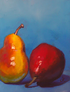
"Cousins," 6x8, oil on canvas board

This is another hot one. The colors, I mean. A few recent things have had those vibrating colors. I read somewhere recently that children like bright colors, and as you mature you come to appreciate the quieter colors. Maybe visually I'm still a kid. Hey, Justin Clayton also just did a painting of two pears, one standing; one lying down. Quite a difference.

I don't know. I'm going to go paint.

Monday, November 5, 2007

"Two Tiny Persimmons," 5x5, oil on gessoed board

Connie Kleinjans, original oil painting, Two Tiny PersimmonsOK, this is the last thing I did in last month's workshop. It's little, and I did it one afternoon after class ended. But I do love persimmons; they're photogenic. I find it interesting to note, though, that a few months ago I did some 4x4 paintings, and the size was fine. But now this 5x5 feels cramped to me. I've been trying to paint with bigger brushes, so maybe that's why. They say you should paint with the biggest brush you can stand to keep from futzing.

Friday, November 2, 2007

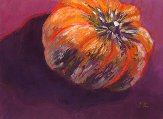
"Neon Gourd," 6x8, oil on canvas board

Connie Kleinjans, original oil painting, Neon Gourd,6x8After yesterday's dark picture of three figs, this one seemed almost neon bright. Now, I've been noticing that a 6x8 painting of one item gets finished faster than an 8x10 that's more complicated (duh). This one, though, while only one item, was a pretty complex one: all those lobes, and the green and white streaks. It was pretty hard to draw. Also, while I decided to put the focal point in the upper right quadrant, I didn't want the gourd facing in. Having it face out seemed different and more interesting. And I still put the shadow behind it. Now, this gourd has a pointy bottom, so it kind of sat askew. All of that contributes to a sense that it's floating, or even flying. I almost named this Flying Gourd.

Thursday, November 1, 2007

"Fig 3," 6x8, oil on canvas board

NFS. I felt like painting figs. I now love painting figs! You have to mix a kind of greenish purple (or purplish green), which shouldn't be possible since they should make brown. Maybe they're next to each other on the canvas, so they're not mixing. I don't know, but it works. I also got the frost edge that you see on fruit like this. It's a matter of not letting your brain fool your eye: Just look at the color; it really is just purple with some white mixed in.

This is a departure for me, at least for recent stuff. I've been doing bird's eye compositions with primary colors that look hot near each other. This is darker, more like the chiaroscuro paintings. Sort of. And it's at eye level. I must buy more figs to paint while they're in season. These got eaten pretty quick.

Tomorrow's painting will be a pretty big contrast.