Tuesday, January 31, 2012
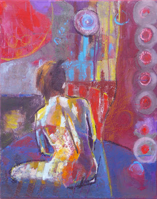
"Ponder"
20x24x0.75, oil on canvas
I did this a few months ago. It was one of the early ones where I used a technique from my class with Melinda Cootsona: You start with abstraction and play with it until you find a figure. I find the playing really important, since it's when you apply paint intuitively, and it doesn't matter how it looks, so you're more free. You also get to experiment with marks, so you improve your painting vocabulary. Melinda likes to create more layers in her paintings before she finds the figure. I can see where that would add richness. I should do that. I guess I need more patience.
Here, I started with a painting that hadn't worked for me, then painted on that, so it had two layers under the figure. The earlier painting had had a chair with slats in it, and the paint had formed ridges. I kept those and liked how they overlapped the figure. (I later used this overlapping in another painting, posted earlier this month.) I'm also really enjoying the oil crayons. I like the scribbly texture.
I took a picture of the painting during development. You can see the random marks and drippies and scribbles. As I recall, I turned it in different directions while playing with it. And you can also see that I kept the large round shape in the upper left corner.
Monday, January 30, 2012
Painting upside down
11x14x1.5", oil on canvas
In my last post I mentioned that I'd painted a head by turning the reference photo and the canvas upside down. (Thanks, Melinda.) This was the picture that came out of that. It's a pretty cool exercise. You're less attached to how realistic it is -- these aren't portraits -- so it lets you start painting looser and not get buried in details. I decided to place him in the corner of the canvas because I'd chosen a kind of grizzled picture, and I thought he looked more expressive this way. Sort of like he's hiding or something.
Wednesday, January 25, 2012
"Introspection"
36x36x0.75", oil on stretched canvas
OK, this one surprised me. I had a background with lots of texture and color, then started working on a face and got frustrated. So, using a trick from a recent class with Melinda Cootsona, I decided to turn the reference photo and painting upside down. When you work with an image upside down, you're less invested in how accurate the shapes are. Rather, you're more in touch with the composition. Also, I had seen some paintings where light blue was used as a way to articulate contours on a dark background, so I used that. Eventually, when I turned it right-side up, I liked it much more, and I clarified a few things and balanced the values better.
That blue really is kind of neon, isn't it?
Wednesday, January 4, 2012
"Geometric"
In an earlier painting (that I haven't posted yet), I had a figure with lines crossing it. Wherever that happened, colors changed on the figure. I used that approach here. It's relatee to some earlier work I did, where I painted still lifes in non-representational colors. The theory is that, if you keep the value the same, you can still figure out what the subject is. I can't say that I stuck with actual values here, but I hope that makes the work more interesting. You can still see the figure, but it merges in the background more.
Subscribe to:
Comments (Atom)


