Sunday, November 30, 2008

"Blue Plate Special #3"

Connie Kleinjans fine art11x14, oil on canvas board

Here's the third painting using the see-through plate. I'm working larger, although I don't know why. But art is like that: You go a lot on impulse and but have to learn which parts to discipline. When I first called this finished and looked at it, I kind of didn't like it. It seemed too simple. But then something clicked and it began to look more graphic and more profoundly simple, if that makes sense. I love the work of Euan Uglow and, while I certainly can't compare my work to his, it's possible that what I like about his work is also what I like about this.
Saturday, November 29, 2008

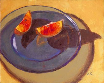
"Blue Plate Special #2"

Connie Kleinjans fine art8x10, oil on canvas board

Another in my transparency series. I mean, not an official series, mind you. Just a challenge I want to learn from. And I'm still using the blood oranges.

Interesting recent posting by Aaron Lifferth discusses how to squint, or do something equivalent. Besides what Aaron does, which is interesting, a couple of the people commenting do interesting things, too. Check it out.

Saturday, November 22, 2008

"Blue Plate Special #1"

Connie Kleinjans fine art
8x10, oil on canvas board

I seem to be into backlit fruit these days. A couple of weeks ago I bought some blood oranges, since the to colors inside are so gorgeous. I also began to plaint the blue glass plate on different backgrounds (I used the matching bowl in an earlier piece). The glass colors were deucedly difficult to figure out! I'd use the little holes in my ViewCatcher to isolate the color in an area, paint that, then notice that it no longer made sense next to another area; something would be too dark or too light. So I'd adjust. Then that would shift something else. So I'd adjust again. It's a doozy. For instance: How do compare the red you see through the glass against the red in the shadow of the glass? So you gotta keep comparing. It's one of the truisms of painting.

Since figuring out the colors was so hard, I figured I needed more practice at it. :) So there are a few more paintings coming with the blue plate on different colors, hence the numbering in the title. For some reason, it felt right to go a little bigger, too. Go figger.

Monday, November 17, 2008

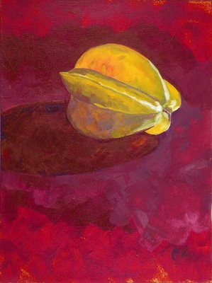
"Starfruit, Backlit"

Connie Kleinjans fine art9x12, acrylic on canvas paper

I was recently in Hilo, on Hawaii's Big Island. At my friend's house there was this beautiful starfruit. I found some fabric in the house to use as a backdrop and set up a lamp so the fruit was backlit (nothing like patient friends who let you use household items to jury rig a studio). I also bought a pad of canvas paper and borrowed brushes and acrylic paints from my friend. I think I did OK getting the glowing effect, and it was interesting to see how transparent some paints are and how opaque others are. But, wow, acrylics do dry awfully fast!

And here's the wikipedia star fruit page, which points out that it's closely related to the bilimbi.

Sunday, November 16, 2008

"Last Hurrah"

Connie Kleinjans fine art6x8, oil on canvas board. Sold.

I did this one a few weeks ago. I like doing a bright underpainting and letting spots show through, and sometimes I like doing a bright underpainting and just not bothering to cover it. It works better on a larger canvas (I did a few like that in February of this year).

Saturday, November 15, 2008

"Shy Persimmon"

Connie Kleinjans fine art6x8, oil on canvas board

I so admire the blogging painters who can finish something every day and post it. Or even four or five days a week. I seem to go in fits and starts. I'll be on a roll for a few days and won't bother posting, or I'll do something I'm not that crazy about and won't feel like it, at least until I have more things I like. Recently I've found that the daily expectation has become a burden, which makes painting less fun. That's definitely not what I want.

Meanwhile, I felt I was getting too tight, so I painted this over something else so I wouldn't care so much about it. It's better. What I was going for was the sense of the persimmon being half in the shadow, and I also wanted to get the reflection in the tea cup. That's the object on the right (I'm not sure it reads well), and the hash marks are design elements on it.